Column Chart in Excel
A Column Chart is one of the most common charts in Excel. It is a visual representation of data and is really good when you want to show time on the X axis (bottom axis) and values on the y axis (side axis). When used correctly it can be one of the most powerful visual aids inside of Excel when it comes to reporting. This article will take you through the steps to create a column chart.
Create a Column Chart
To create to column chart, highlight the Excel range which you want included in the chart. Include the headings in the area which is highlighted as this will help with axis labels later on.

In the above example the data B1 to D6 is highlighted.

Choose the Insert Menu.
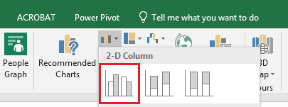
From the charts section choose a 2D column chart.
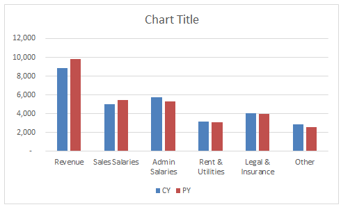
The above chart is instantly produced. This chart should be seen as a starting point and can be cleaned up to make it more visually pleasing. Generally I tend to remove the horizontal lines on the chart and the Y axis. Add data labels, either have data labels or a Y axis, not both.
With some manipulation the column chart can be tidied up to look as follows.

The attached Excel file has the above data set and chart inside it if you wish to practice creating a column chart.