
USA Demographic Excel Dashboard with Heat Map
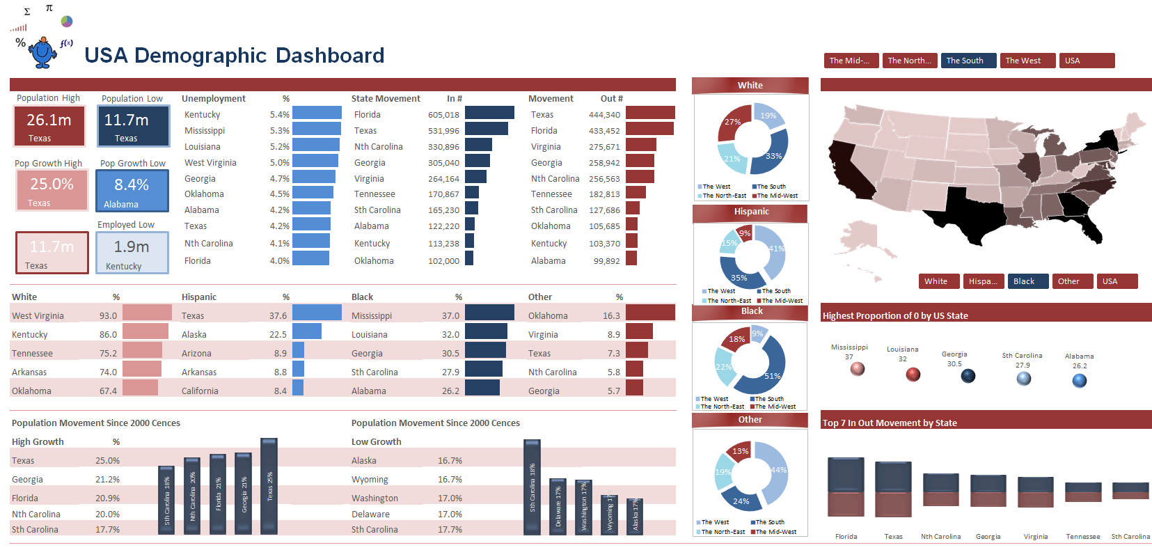
This Excel dashboard shows demographic information for the USA. For an Excel dashboard it displays quite a lot of information in a small space. It introduces a heat map in the body of the dashboard which shows high concentrations of particular demographics, such as race and the body of the dashboard displays high level data by geographic region. The dashboard is a play on 3 colours and uses them consistently, something to think about when designing your own dashboard creations.
For a listing of all Excel Dashboards on the Smallman.com visit this link. There are more Excel files than you will be able to view!! Excel dashboard creation should be fun and creative, be consistent with your colours, try to align elements of your dashboard, group like items together to ensure flow and get others involved in the process. Group think always produces a more informed outcome.
The following file is a macro enabled workbook and my web provided only allows xls or xlsx workbooks. All of the data which feeds the above Excel dashboard is contained within the file.
