
Data Trends Dashboard
Data Trends Dashboard
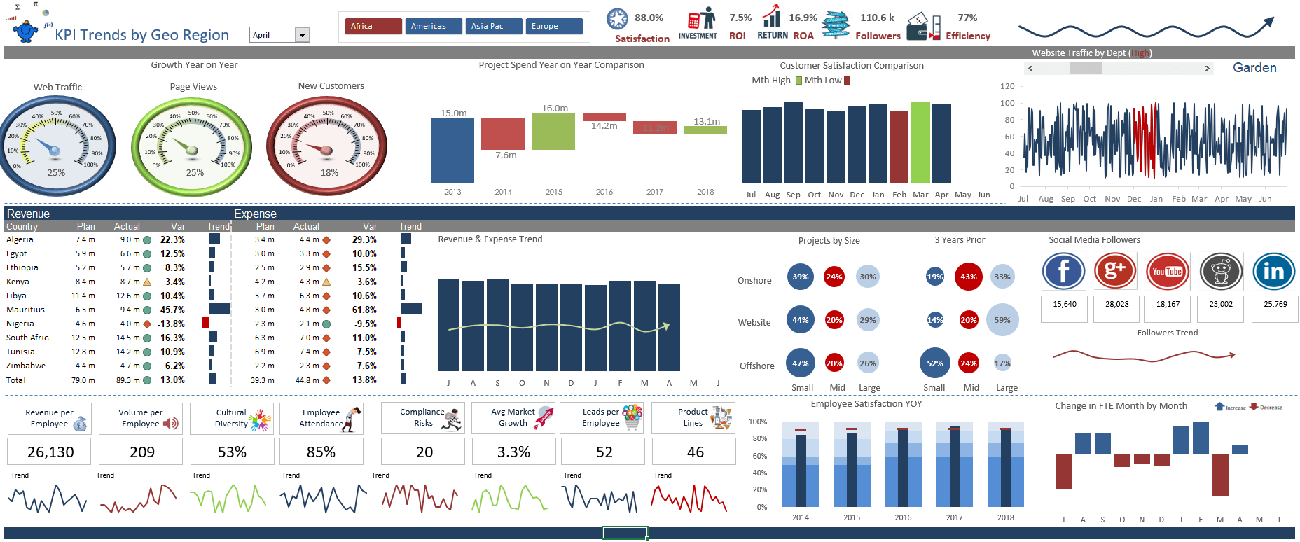
A range of organisational and operational metrics displayed in a clean neat Excel dashboard.
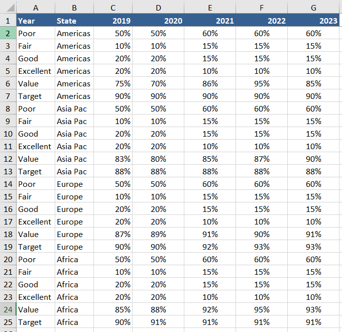
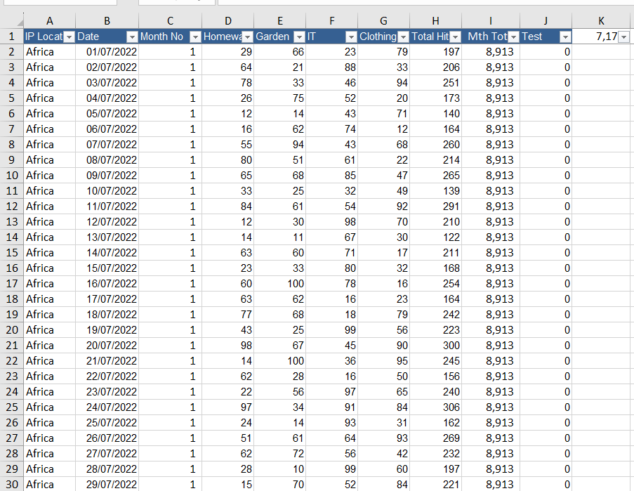
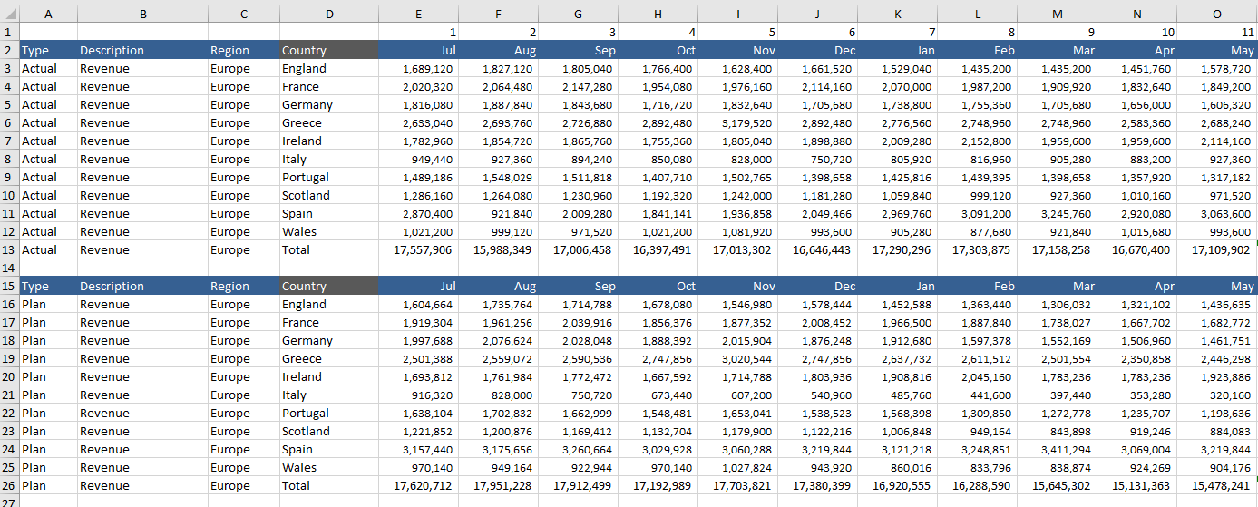
The report provides a range of data with a high amount of detail. Some of the metrics covered include revenue v plan, expenses v plan on a region by region basis. Project spend, customer satisfaction, website visitors by department, 24 month trend analysis for revenue by employee, volume by employee, cultural diversity, attendance, risk, market growth, leads and product lines.
There are a number of charts including some high level gauge charts, a waterfall chart, customer satisfaction, employee satisfaction, change in FTE and an interesting look at projects by size comparing current year to the same period (n ) years ago. The report contains a range of interesting infographics which tie in well with the underlying dataset.
The report uses a slicer to spin the dashboard by region and the details by country will change accordingly. There is a combo box which allows the monthly aspects of the report to change showing YTD data seamlessly.
Users will gain the maximum benefit from this file if they are already competent spreadsheets users. The file is designed for people who use Excel on a regular basis, and are comfortable with using its tools and functions. Incorporation of new data should be plug and play considering the calculations you wish incorporated.
Included
1 Excel File (12 Tabs)