
Sales KPI Report


Sales KPI Report
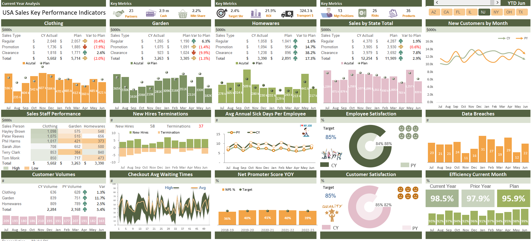
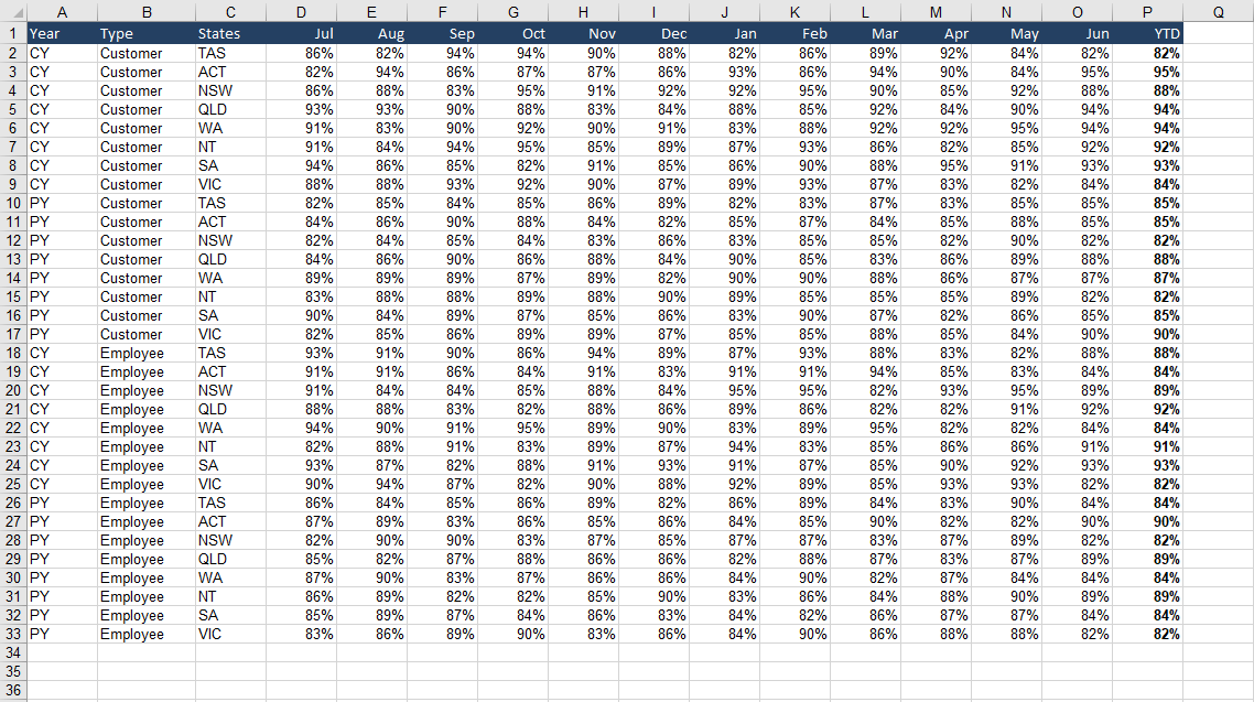
A KPI dashboard report showing key indicators year to date with customer and key staffing metrics.
This financial summary KPI dashboard is highly interactive - it will summarise data by geographic region by month on a range of topical metrics. The report uses a spinner button to create changing YTD position. As such the formulas on the calculation page are pliable based on the selection from this button. A slicer is used to generate regional summaries and the output draws on my one cell to rule them all methodology to change every element of the report.
The report is clean and clear with a range of metrics including sales comparisons, variance to plan, terminations, new hires analysis, employee and customer satisfaction, average wait times, net promoter score and customer volumes. The underlying data can be changed to suit a range of different metrics quickly and easily - the entire design is elegant and simple to update and this report would be a well received dashboard to any corporate environment.
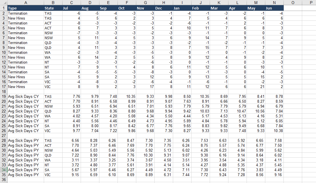
Users will gain the maximum benefit from this file if they are already competent spreadsheets users. The file is designed for people who use Excel on a regular basis, and are comfortable with using its tools and functions. Incorporation of new data should be plug and play considering the calculations you wish incorporated.
This business tool includes
1 Excel File (14 Tabs)