Toggle Chart Using An Excel Slicer
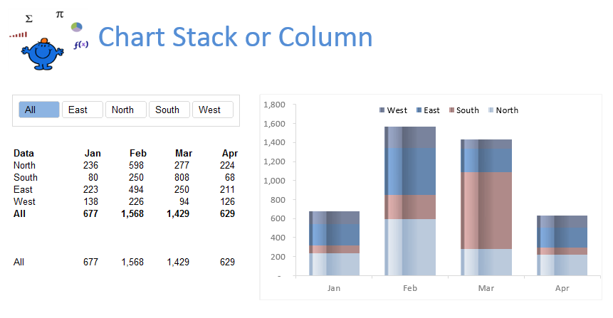
The following chart is the result of the blog post. It displays a chart based on the selection from a slicer. It is run by a worksheet change event which toggles between a Stacked Bar chart and a 2D Column chart. The trick is to create two charts one for each of the regions and one for the grand total or all regions. That way you can toggle between region and grand total. The following is what the grand total (All) looks like:
The attached Excel VBA example shows how to toggle the stacked bar chart show to a regular 2D chart.
While the following VBA procedure helps run the process. It is a toggle between the two charts depending on what Slicer selection is made. The All choice produces the consolidation where as the region choice produces just a column chart.
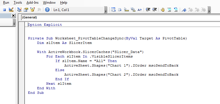
The following needs to be placed into the sheet module which contains the pivot table.
Option Explicit
Private Sub Worksheet_PivotTableChangeSync(ByVal Target As PivotTable)
Dim slItem As SlicerItem
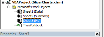
The above is the sheet with the pivot table (Sheet3) is the worksheet code name and Piv is the sheet name.
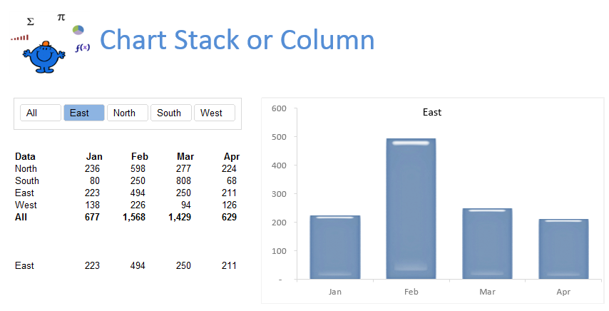
While the following shows a the region isolated in the Slicer and the chart reflecting the numbers for the region chosen in the slicer.
The following Excel file highlights the technique, with the above practical example.