
Excel Sparklines Charts
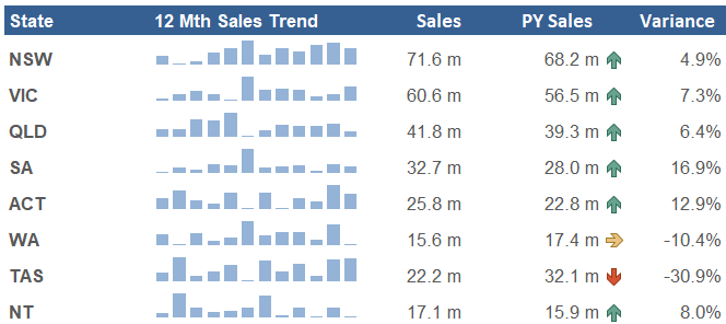
A sparkline chart in Excel is a small chart in a worksheet cell that shows a movement in data over time. The use of sparklines is to show a trend capturing the ups and downs over a period. You can also use sparklines charts to show the peaks and troughs (maximum and minimum) over time which is a really nice feature. They are used to enhance the visual effects of reports and to show a pattern. The following is an example of what sparklines can look like in a simple report.
A Sample Line Sparkline

The above sparklines show the high in green and the low in maroon.Just by looking you can see where the highs and lows are and it prompts further investigation.
A Sample Column Sparkline
Here is the same data displayed with a column chart style. You just need to decide which look works for the data you are attempting to present.
Creating Excel Sparklines
Creating your own sparklines in an Excel workbook is straight forward, simply follow these steps to create them in moments.
1. Select the cells you want the sparklines to appear.
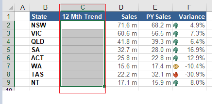
In the above example I selected cells C2:C9.
2. On the Insert menu - Choose the Sparklines section.
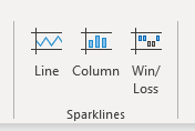
Choose the Sparkline that best fits your data.

Choose the data range you require.

Once you hit OK - the in cell Sparkline chart is created.
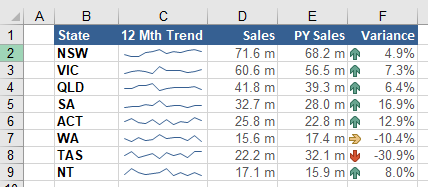
The above is the basic sparkline however it can be changed to include a range of different features.
Formatting the Sparklines
When you put your cursor in a cell a with sparkline in it, a new ribbon appears, this is the sparklines design ribbon. In this section you have access to change the look and feel of the sparklines such as the colour and adding high low markers to the sparkline.
This is where all the formatting options for sparklines are included. Some of the key formatting / customization options available are:
Make alterations to the type of sparkline, line sparkline, column sparkline and win/loss sparkline.
Change the data source of the dashboard, in case the data source grows or shrinks, the edit button can be used to change the source data.
Set the axis minimum and maximum values. This can potentially have a drastic affect on the dashboard so should be used with discretion.
Group and ungroup the sparklines. This allows you to affect each sparkline individually. For example clear one of the sparklines if you wish.
Remove the spraklines all together.
Verdict on Excel Sparklines
Sparklines are reasonably easy to create and form a nice addition to any summary report where trends are shown. It gives a high level view of data in a visual setting that allows users to quickly absorb the trends over time. The draw back is that there is so few options for sparklines. Only a line and bar chart and very little development on the product in recent years.
The following Excel file can be used to recreate the sparklines shown in this Excel tutorial.