Popular Ready made Dashboards
Excel Dashboards for Everyone
Easy to incorporate your own data into these Excel files. Save time, ready made turnkey design. The following are dashboards that have been requested from my dashboard page. They are quite detailed and follow sound modelling principles. Unlocked and ready to go.
Buy Dashboards Individually or in a bundle
Digital Product - just add your data to the file and away you go.
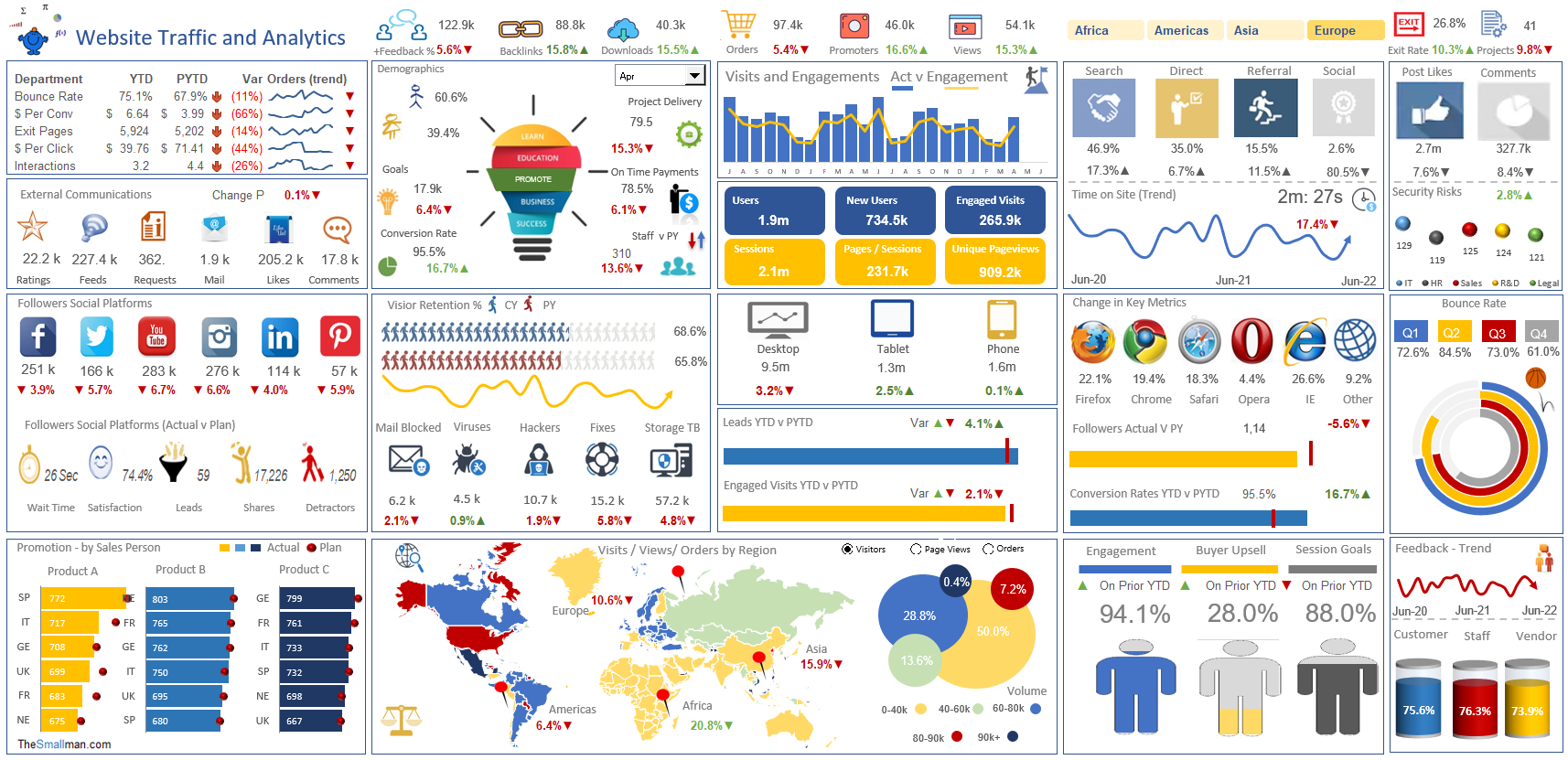
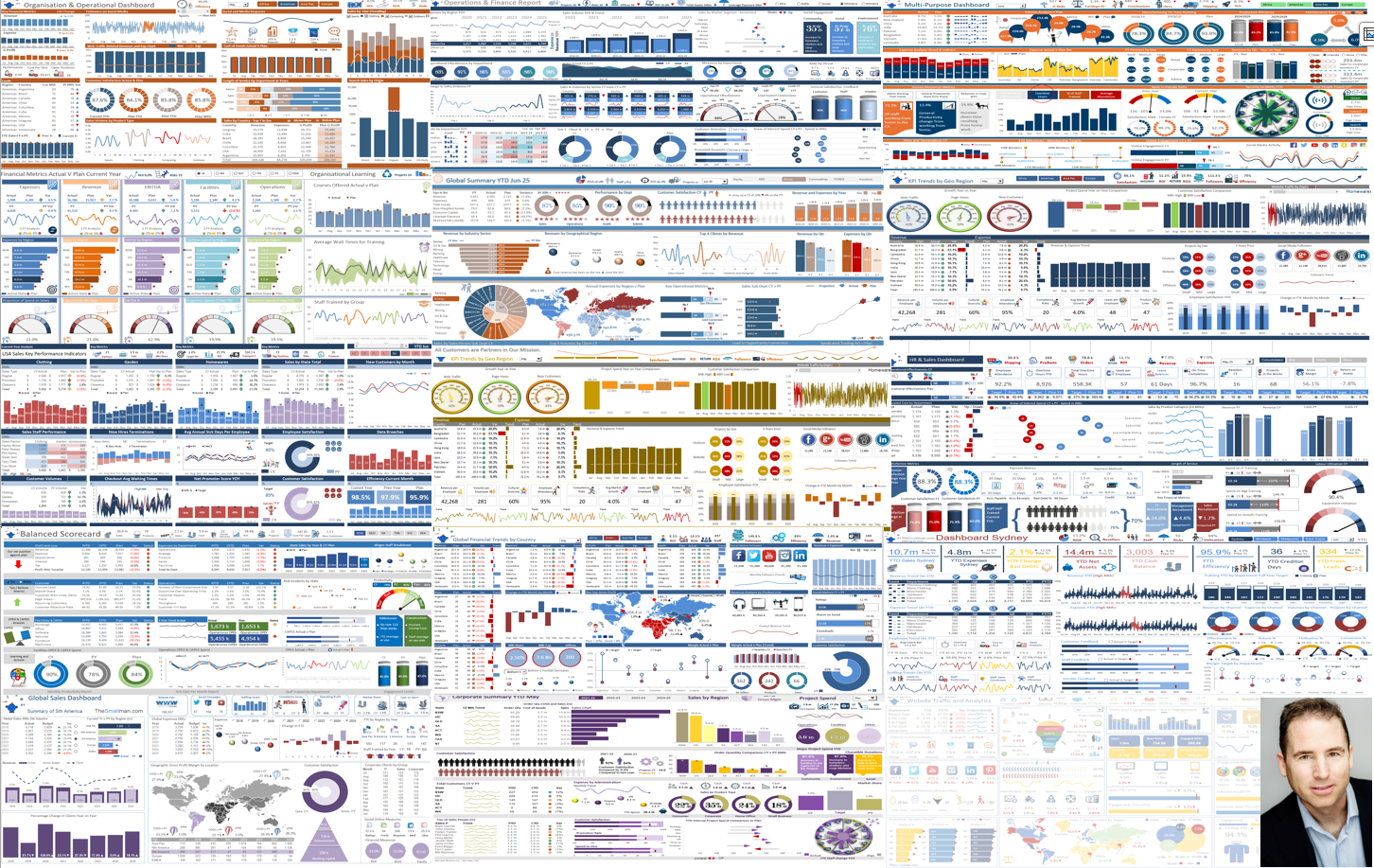
Website Analytics Dashboard
This is a highly detailed web analytics dashboard, for key web and organisational metrics.
Ready-to-use and instantly downloadable, this tool is excellently presented, whilst being clear and easy for the user to manipulate.
This web dashboard is an important resource for professionals to monitor and track the strengths and weaknesses of specific department areas, in order to increase performance. Within this tool are a number of key metrics, these include:
- Revenue and Expense, Gross Profit trending charts.
- Actual v Plan revenue and expense by channel and geographic region.
- Length of service by Year (banded).
- Satisfaction metrics, including customer satisfaction change year on year and staff satisfaction change in time.
- Sales search by origin, direct traffic, referral, organic, social media.
- Social metrics – including feeds, requests for information, comments, likes and mail.
- Other include: Sales by department, full time equivalents actual v plan, key HR metrics, staff performance, cost per hire by region and open positions, there are also a range of cool charting techniques which tell a compelling story.
There is a logical progression for the inputting of data in order to best calculate the results of your team.
If you have any questions regarding this tool, don’t hesitate to reach out by email directly.
If you’ve found this tool useful, show your appreciation by leaving a rating and a review!
This business tool includes
1 Excel File (12 Tabs)
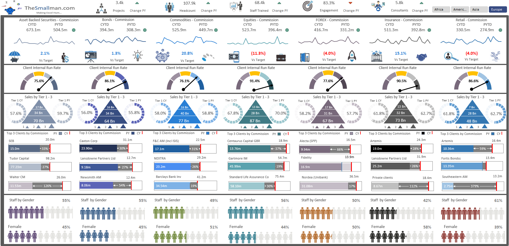
This is a highly detailed, yet succinct Key Performance Indicators dashboard for key operational and organisational metrics. Ready-to-use and instantly downloadable, this tool is excellently presented, whilst being clear and easy for the user to manipulate.
This corporate reporting dashboard is an important resource for professionals to monitor and track the strengths and weaknesses of specific department areas, in order to increase performance. Within this tool are a number of key metrics, these include:
- Revenue and Commission, FTE (headcount), major project tracking.
- Actual v Plan revenue and commission by department and geographic region.- Staff trained versus prior period by region.- Staff gender analysis by department and by region.
- Consultants engaged versus prior period by region.
- Sales search by origin, direct traffic, referral, organic, social media.
A deep dive into the revenue by client listing the top 3 clients for all 7 generating departments within the organisation producing 84 graphical displays showing key commission versus prior period.
There is a logical progression for the inputting of data in order to best calculate the results of your organisation. Some spreadsheet knowledge of setup is required. If you have any questions regarding this tool, don’t hesitate to reach out by starting a discussion through private messaging.
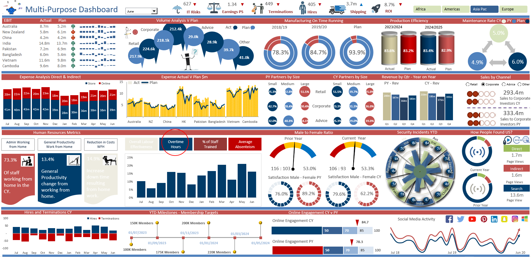
All the charts, fantastic financial modelling layout. Just enter your data into the input pages and the calculations will populate the charts.
Ready-to-use and instantly downloadable, this tool is excellently presented, whilst being clear and easy for the user to manipulate.
This multi purpose dashboard is an important resource for professionals to monitor and track the strengths and weaknesses of specific department areas, in order to increase performance. Within this tool are a number of key metrics, these include:
- Allocated cost by Department, Actual vs. Plan
- Satisfaction Metrics, including Customer Satisfaction Change Year on Year, and the Staff Satisfaction Change in Time.
- Hires and Terminations
- Online Engagement
- Cost of Goods Sold (COGS)
- Overtime metrics
- Absenteeism
- Other include: Membership targets, Staff Satisfaction, Earnings per share, ROI, IT Risks, Shipping, Staff Productivity, Volume analysis.
There is a logical progression for the inputting of data in order to best calculate the results of your team.
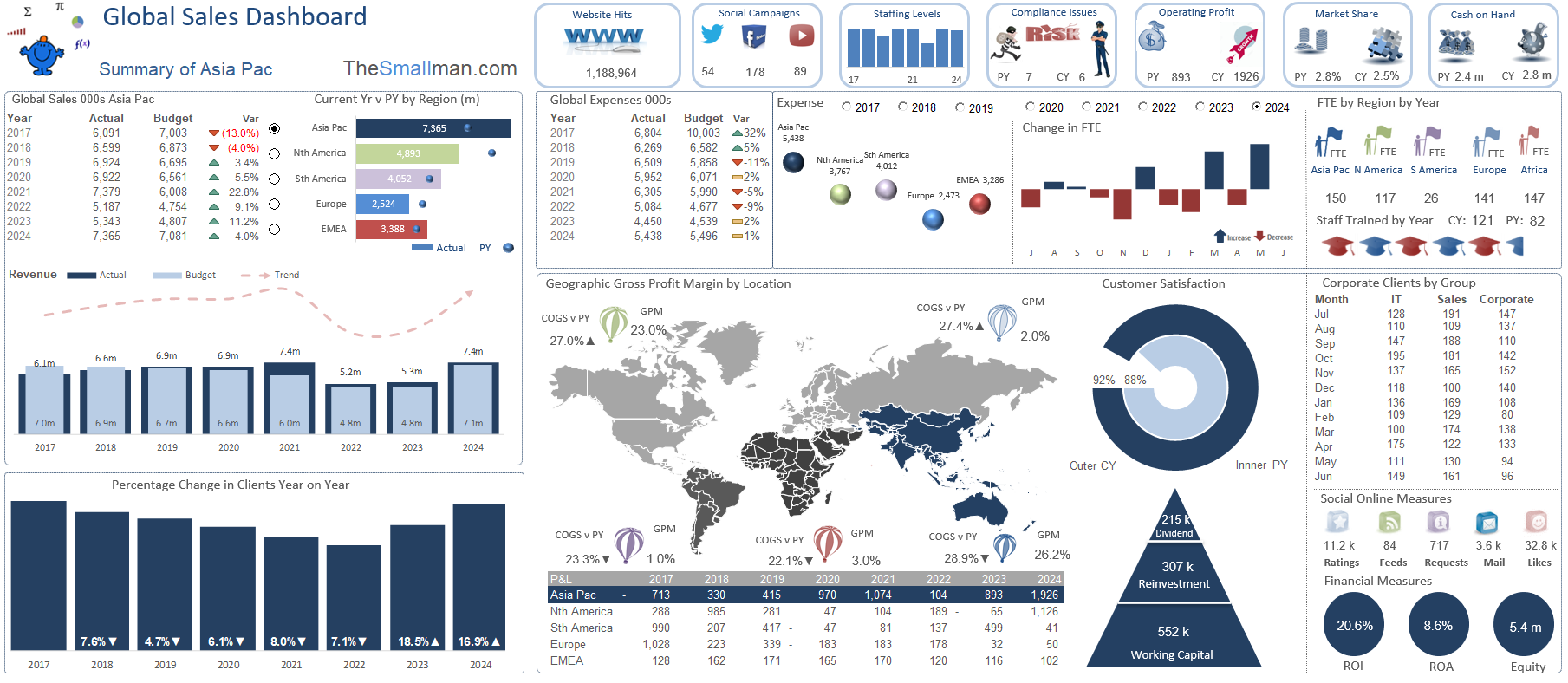
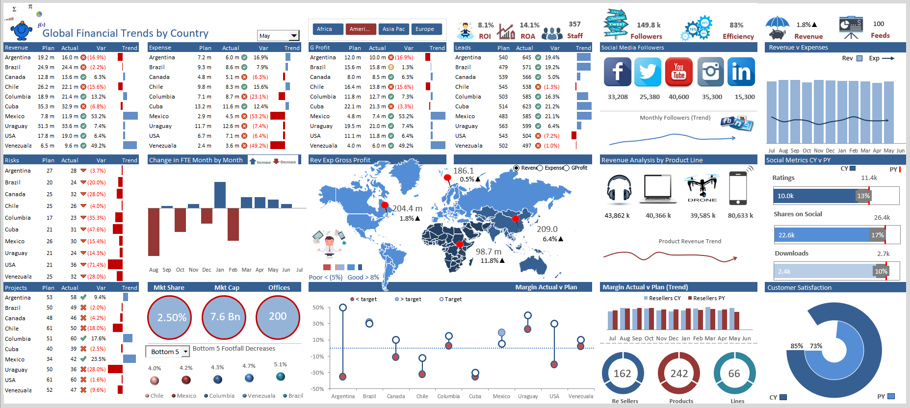
Global Sales Dashboard with Heatmap
An sales dashboard displaying key metrics from around the world by month and year to date. The dashboard is flexible and takes fresh data easily.
This is a ready-to-use, instantly downloadable global sales key performance indicator dashboard for professional use.
A highly detailed, yet clear and well-presented Excel spreadsheet, this tool will help to effectively monitor and record the progress and performance of your sales team on a global level. It contains a range of metrics which are displayed in a top-level dashboard, including a geographic heat map.
The following metrics are included for manipulation and monitoring:
- Global Sales, Actual vs. Budget
- Percentage Change in Clients Year on Year
- Geographic Gross Profit Margin by Location Heat Map: This lights up when a certain region is selected. The entirety of the dashboard will change colour based on the chosen region.
- Dividend, Reinvestment, and Working Capital
- Global Expenses
- FTE by region by year
- Social Media Online Measures
- Website Hits
- Staffing Levels
- Compliance Issues
- Operating Profit
- Market Share
- Cash in hand
1 Excel File (14 Tabs)

This is a highly detailed, yet succinct Key Performance Indicators KPI dashboard for Human Resources and Finance.
Ready-to-use and instantly downloadable, this tool is excellently presented, whilst being clear and easy for the user to manipulate.
This KPI (Key Performance Indicators) dashboard is an important resource for professionals to monitor and track the strengths and weaknesses of specific department areas, in order to increase performance. Within this tool are a number of key metrics, these include:
- Allocated cost by Department, Actual vs. Plan
- Satisfaction Metrics, including Customer Satisfaction Change Year on Year, and the Staff Satisfaction Change in Time.
- Staff Trained
- Length of Service (from under 6 months up to over 10 years)
- Cost of Goods Sold (COGS)
- Revenue
- Operational Metrics
- Other include: Employee attendance, Overtime Hours YTD, Total Overtime Hours, Leads per Employee, Leave Balances, On time Completion, Resellers, and Projects in the Works.
There is a logical progression for the inputting of data in order to best calculate the results of your team.
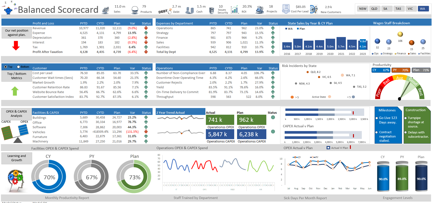
Balanced Scorecard in Excel
This is a highly detailed, yet succinct Balanced Scorecard dashboard which covers four distinct areas, finance, operations, customer and learning and growth.
Ready-to-use and instantly downloadable, this tool is excellently presented, whilst being clear and easy for the user to manipulate, simply add your own data.
This balanced scorecard dashboard is an important resource for professionals to monitor and track the strengths and weaknesses of specific department areas, in order to increase performance. Within this tool are a number of key metrics, these include:
- Allocated cost by Region, Actual vs. Plan
- Satisfaction Metrics, including Customer Satisfaction Change Year on Year, and the Staff Satisfaction Change in Time.
- Key learning metrics, current year, prior year and plan
- Number of projects, cash on hand, debt levels number of products,
- Net Promoter Score over time.
- A whole range (25) of operational and customer Metrics.
- Others include: Operations and facilities spend on CAPEX, actual v plan, average customer waiting time and many more.
There is a logical progression for the inputting of data in order to best calculate the results of your team.
If you’ve found this tool useful, show your appreciation by leaving a rating and a review!
This business tool includes
1 Excel File (15 Tabs)
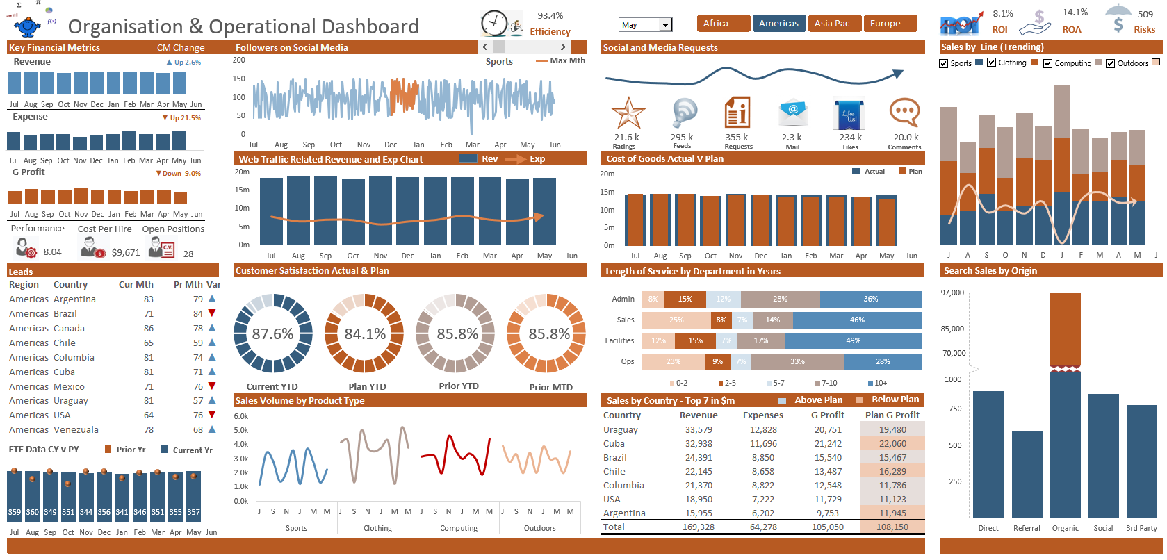
Whole of Organisation Dashboard
This is a highly detailed, yet succinct Key Performance Indicators dashboard for key operational and organisational metrics.
Ready-to-use and instantly downloadable, this tool is excellently presented, whilst being clear and easy for the user to manipulate.
This KPI (Key Performance Indicators) dashboard is an important resource for professionals to monitor and track the strengths and weaknesses of specific department areas, in order to increase performance. Within this tool are a number of key metrics, these include:
- Revenue and Expense, Gross Profit trending charts.
- Actual v Plan revenue and expense by channel and geographic region.
- Length of service by Year (banded).
- Satisfaction metrics, including customer satisfaction change year on year and staff satisfaction change in time.
- Sales search by origin, direct traffic, referral, organic, social media.
- Social metrics – including feeds, requests for information, comments, likes and mail.
- Other include: Sales by department, full time equivalents actual v plan, key HR metrics, staff performance, cost per hire by region and open positions, there are also a range of cool charting techniques which tell a compelling story.
There is a logical progression for the inputting of data in order to best calculate the results of your team.
If you have any questions regarding this tool, don’t hesitate to reach out by email directly.
If you’ve found this tool useful, show your appreciation by leaving a rating and a review!
This business tool includes
1 Excel File (16 Tabs)
KPI financial dashboard showing key metrics revenue, expense, gross profit/loss and other operational and staffing metrics.
A key metrics organisational dashboard focusing on revenue and expenses.
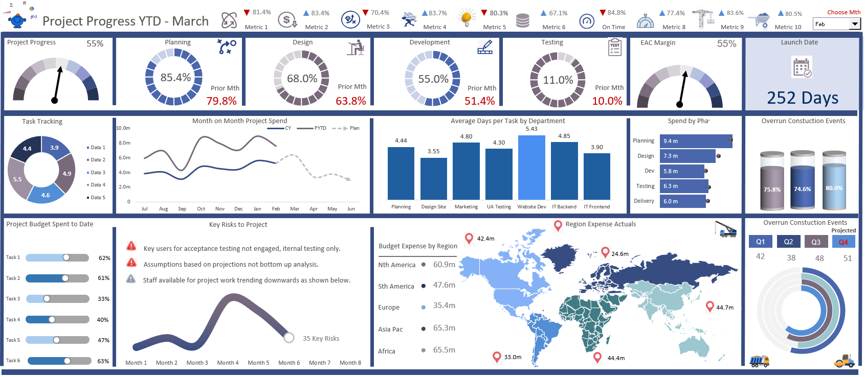
The report summaries a broad range of Project based data both financial and non financial data in a succinct one page summary. The report compares actual to plan to prior year data for the following revenue, expenses, project tracking, planning. Additionally the report considers key metrics tracking by task and by month in easy to follow charts.
The file has the ability to track a range of metrics and plot the completed percentage against each metric. The filters help compare sales, volume, commission and transactions. The various departments have automatically generated drill down depending on selection making the combo boxes dynamic.
One of the nice aspects of this dashboard is it uses a heat map to determine performance against a predetermined plan. A colour code is added to the file for exceeding or falling short of financial expectations. This adds a certain dynamism to the report which helps non financial people digest the data quickly and easily.
Users will gain the maximum benefit from this file if they are already competent spreadsheets users. The file is designed for people who use Excel on a regular basis, and are comfortable with using its tools and functions. Incorporation of new data should be plug and play considering the calculations you wish incorporated.
If you have any questions regarding this tool, don’t hesitate to reach out by email directly.
This business tool includes
1 Excel File (10 tabs)
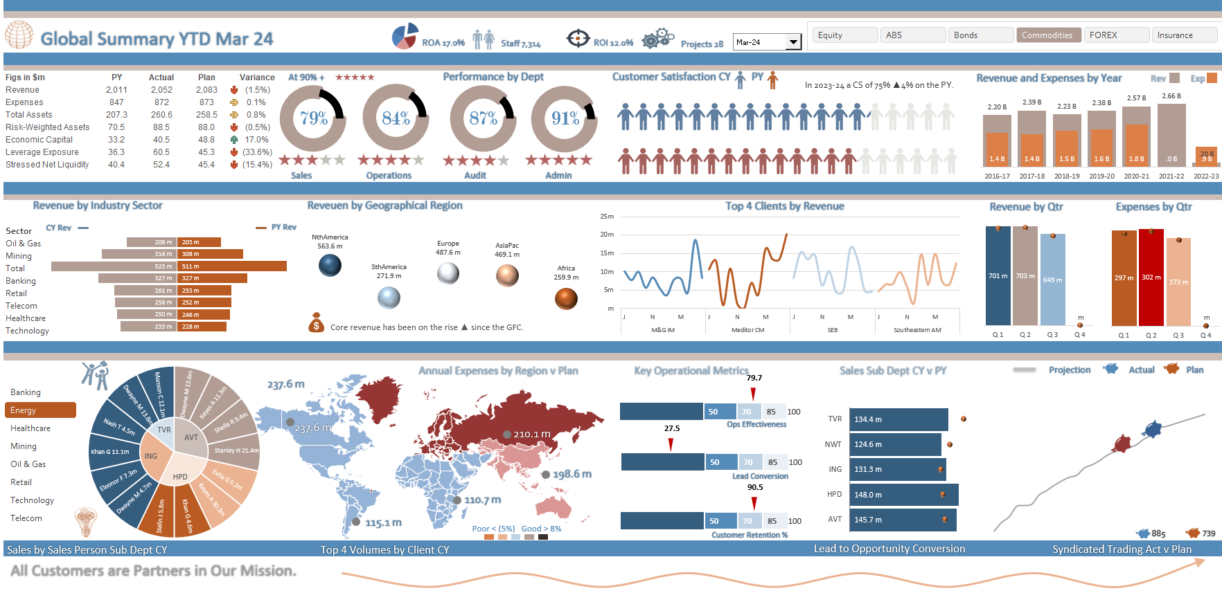
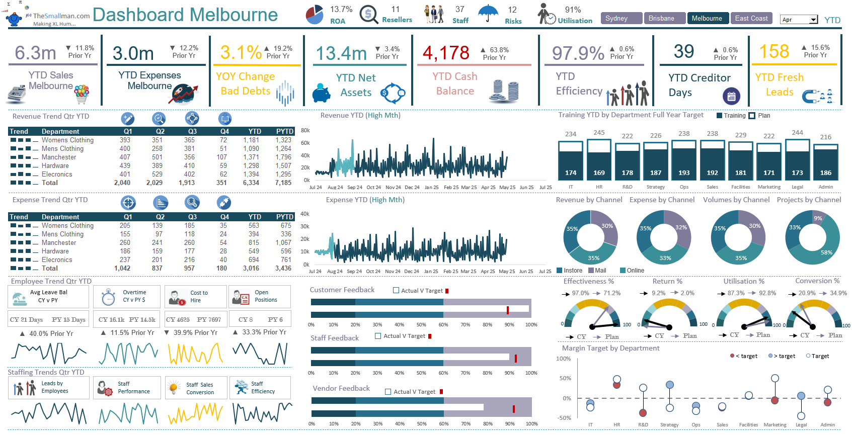
A global dashboard that has a range of metrics on a single page. Track revenue and expenses month and ytd against prior year and plan.
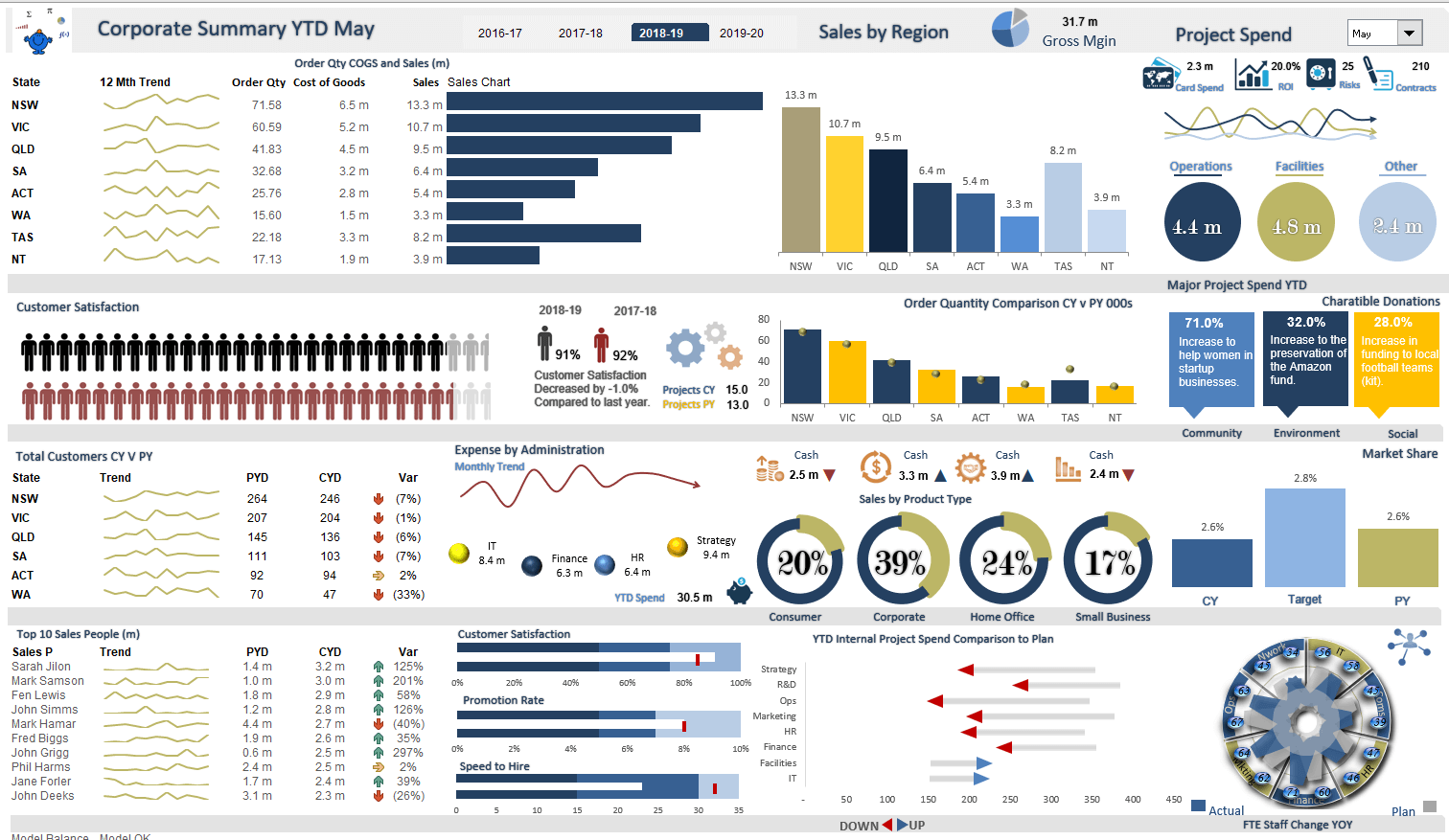
An administration dashboard that helps to keep track of a range of metric, including revenue, expense operations and human resources.
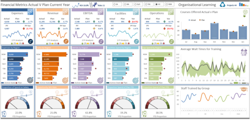
A YTD Excel dashboard model that displays key operational and staffing metrics in a single page.

A three statement financial model which outlines the income statement (P&L) statement of financial position (balance sheet) and statement of cash flows (Cash Flow Statement). It is a fully reconciled financial model with a full trial balance worksheet. The model has the ability to run scenario analysis, change modelling years. It has 1 year of monthly forecasts and 4 full years of forecasts for all 3 statements, making a 5 year financial model. The model has a loan schedule, to generate a repayment program, a working capital schedule to assist with accounts payable and receivable. An asset schedule to help manage the fixed assets, intangible assets and any assets under construction.
The model allows you to seamlessly change the the key timelines;
Change key assumptions, around revenue, expense, accounts receivable, accounts payable, key asset lives and a host of other key metrics.
The model is laid out clearly in a well structured way and has been used as the baseline for my 3 statement modelling courses for 6 years now.
Included - 1 Excel File (19 Tabs)
Dashboard Bundle - 14 Dashboards
It started as 10 but expanded to 14 Excel Models
A bundle of 14 premium (plus 1 bonus file), ready-to-use Excel dashboard models. Models which have a range of organisational, operational and finance metrics. Change to suit.
Valued Customers
Top Accolades from Excel Blog Ranking Sites
The Smallman.com has been recognised as one of the Excel best blogs on the web today. These are some of the most respected blog ranking sites for Microsoft Excel, they are independent and we are grateful for their tick of approval.