Excel

TheSmallman.com

an XL ideas Lab

Dashboards VBA
  • Home
  • Dashboards
    • Tips & Tricks
    • Charts
    • Modelling
    • Infographics
    • VBA
  • Shop Dashboards
    • Power Pivot a User Guide
    • Excel Dashboard Course
    • Advanced Dashboard Course
    • Financial Modelling Course
    • Excel VBA Course
  • Blog
  • About
Menu

Excel Dashboards VBA

Street Address
City, State, Zip
Phone Number
an XL ideas Lab

Your Custom Text Here

Excel Dashboards VBA

  • Home
  • Dashboards
  • Excel Tips
    • Tips & Tricks
    • Charts
    • Modelling
    • Infographics
    • VBA
  • Shop Dashboards
  • PowerPivot
    • Power Pivot a User Guide
  • Courses
    • Excel Dashboard Course
    • Advanced Dashboard Course
    • Financial Modelling Course
    • Excel VBA Course
  • Blog
  • About

A Dynamic Pareto Chart in Excel

April 4, 2016 Marcus Small

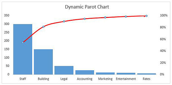
A Pareto chart in Excel is a chart which is made up of a column chart and a line chart to show a cumulative position.  This is often a good chart to show an 80 20 scenario, where 80 % of the costs are achieved by 20% of the cost drivers.  The chart can be created by segmenting the the data into cost drivers or buckets.  If your business expenses were allocated into the following buckets:

  • Staff
  • Building
  • Legal
  • Accounting
  • Rates
  • Entertainment
  • Marketing

The column chart will be labelled costs at the y axis and the cost names will be the X axis.  The costs will be cumulative and the difference with a Pareto chart is the costs start from largest to smallest.  This is what gives the chart its look (see above).  So the chart will need to have some sort of dynamism in order to keep the look and feel of a Pareto chart.

In this situation we can use the Excel's LARGE formula to work out the highest costing item.  The LARGE formula takes the form;

Large(Cell Location, N)  where N is the largest number, 1 represents the largest number in the range, 2 the second largest number and so on.  Then just use a LOOKUP or an INDEX and MATCH formula to trap the item description.  

The following is an Excel example which should help crystallise the concept:

Pareto Chart xlsx


Tags Dynamic, Pareto, Chart, Excel, Formula
← Excel What Column is Filtered Excel VBA Number of Printable Pages →

Featured Posts

Excel Dashboards: Tracking a Crisis

Excel Dashboards: Tracking a Crisis
April 14, 2020

Recent Posts

Populating an Excel Table from a Range of Cells with VBA

Populating an Excel Table from a Range of Cells with VBA June 12, 2025

Fuzzy Distribution with Randbetween

Fuzzy Distribution with Randbetween May 21, 2025

Add Minimum and Maximum for Chart in Cells

Add Minimum and Maximum for Chart in Cells March 12, 2025

Inflation Over Multiple Years in a Single Cell

Inflation Over Multiple Years in a Single Cell January 10, 2025

Hubspot Dashboard

Hubspot Dashboard October 3, 2024

Monthly Dashboard With Supporting Metrics

Monthly Dashboard With Supporting Metrics September 25, 2024

Excel Show Missing Sheet Tabs

Excel Show Missing Sheet Tabs July 29, 2024

Run Macro Overnight Automatically

Run Macro Overnight Automatically June 24, 2024

Split File into Parts and Save to Directory

Split File into Parts and Save to Directory April 20, 2024

Most Popular Author

Most Popular Author December 14, 2023


Follow US:


MarcusSmall@thesmallman.com


TheSmallman.com - Making your small systems hum...
© Copyright 2013-2024 theSmallman.com All Rights Reserved.