Excel

TheSmallman.com

an XL ideas Lab

Dashboards VBA
  • Home
  • Dashboards
    • Tips & Tricks
    • Charts
    • Modelling
    • Infographics
    • VBA
  • Shop Dashboards
    • Power Pivot a User Guide
    • Excel Dashboard Course
    • Advanced Dashboard Course
    • Financial Modelling Course
    • Excel VBA Course
  • Blog
  • About
Menu

Excel Dashboards VBA

Street Address
City, State, Zip
Phone Number
an XL ideas Lab

Your Custom Text Here

Excel Dashboards VBA

  • Home
  • Dashboards
  • Excel Tips
    • Tips & Tricks
    • Charts
    • Modelling
    • Infographics
    • VBA
  • Shop Dashboards
  • PowerPivot
    • Power Pivot a User Guide
  • Courses
    • Excel Dashboard Course
    • Advanced Dashboard Course
    • Financial Modelling Course
    • Excel VBA Course
  • Blog
  • About

The Tennis Chart

July 18, 2019 Marcus Small
Source - Brisbane Times - Article

Source - Brisbane Times - Article

I happened across this article on the Brisbane Times website which outlined the dominance of Federer, Nadal and Djokovic in recent memory.  It really does show how comprehensive their reign has been.  Imagine if there was only one person doing all this?  One day it may happen that someone comes along and dominates for 15 years but for now it has primarily been split 3 ways.  Not many other people have had a look in over this period.

So I thought I might isolate the period from when Roger started winning and really focus on the period after 2003.  Firstly I thought of achieving the result in a bar chart but that did not seem to fit well.  Then I tried a normal column chart and bingo – that was the ticket.  I was able to generate 4 different charts and stack the results.

Tennis Excel chart

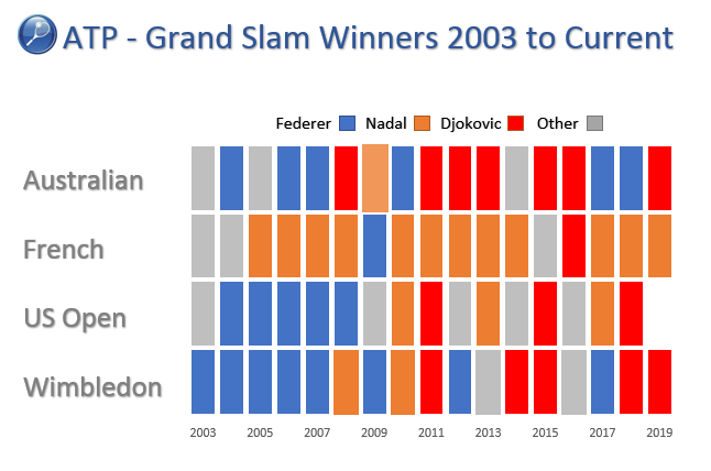
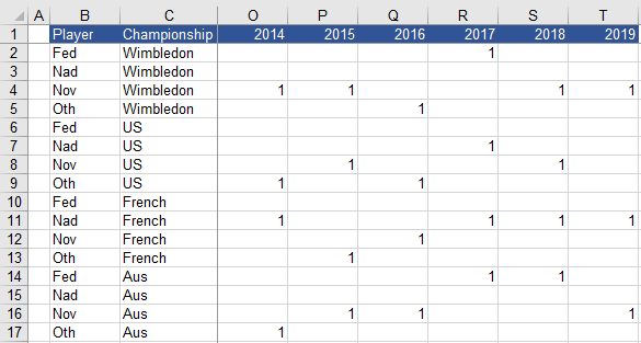
As with most things in Excel how the data is laid out is key. The Excel table has to be set out to give a 1 value against each player for a grand slam win.  See below:

Tennis Excel

Using Wimbledon as the example this is the way the data gets laid out in the sheet.  With the data in this format it will chart nicely.

Tennis Excel graph

Then it is just a matter of adding the other slams to the sheet and making 3 copies of the chart and stacking the charts on top of one another.  I managed to get the data in a single stacked column chart.  The US Open not occurring caused a bit of a problem but this was worked around.  There are two example in the attached file, a stacked Column chart and four column charts stacked. The second is just to show the build up as this was my first attempt.

Attached is the Excel workbook which has this chart and the data laid out within the Excel file.  Happy charting.

TennisExcel.xlsx

Tags chart, graph, Tennis, Excel
← Excel VBA Remove Duplicates Multiple ColumnsSmallman Interview →

Featured Posts

Excel Dashboards: Tracking a Crisis

Excel Dashboards: Tracking a Crisis
April 14, 2020

Recent Posts

Populating an Excel Table from a Range of Cells with VBA

Populating an Excel Table from a Range of Cells with VBA June 12, 2025

Fuzzy Distribution with Randbetween

Fuzzy Distribution with Randbetween May 21, 2025

Add Minimum and Maximum for Chart in Cells

Add Minimum and Maximum for Chart in Cells March 12, 2025

Inflation Over Multiple Years in a Single Cell

Inflation Over Multiple Years in a Single Cell January 10, 2025

Hubspot Dashboard

Hubspot Dashboard October 3, 2024

Monthly Dashboard With Supporting Metrics

Monthly Dashboard With Supporting Metrics September 25, 2024

Excel Show Missing Sheet Tabs

Excel Show Missing Sheet Tabs July 29, 2024

Run Macro Overnight Automatically

Run Macro Overnight Automatically June 24, 2024

Split File into Parts and Save to Directory

Split File into Parts and Save to Directory April 20, 2024

Most Popular Author

Most Popular Author December 14, 2023


Follow US:


MarcusSmall@thesmallman.com


TheSmallman.com - Making your small systems hum...
© Copyright 2013-2024 theSmallman.com All Rights Reserved.