Excel

TheSmallman.com

an XL ideas Lab

Dashboards VBA
  • Home
  • Dashboards
    • Tips & Tricks
    • Charts
    • Modelling
    • Infographics
    • VBA
  • Shop Dashboards
    • Power Pivot a User Guide
    • Excel Dashboard Course
    • Advanced Dashboard Course
    • Financial Modelling Course
    • Excel VBA Course
  • Blog
  • About
Menu

Excel Dashboards VBA

Street Address
City, State, Zip
Phone Number
an XL ideas Lab

Your Custom Text Here

Excel Dashboards VBA

  • Home
  • Dashboards
  • Excel Tips
    • Tips & Tricks
    • Charts
    • Modelling
    • Infographics
    • VBA
  • Shop Dashboards
  • PowerPivot
    • Power Pivot a User Guide
  • Courses
    • Excel Dashboard Course
    • Advanced Dashboard Course
    • Financial Modelling Course
    • Excel VBA Course
  • Blog
  • About

Excel Dashboard Example

November 7, 2020 Marcus Small
Excel Dashboard Template

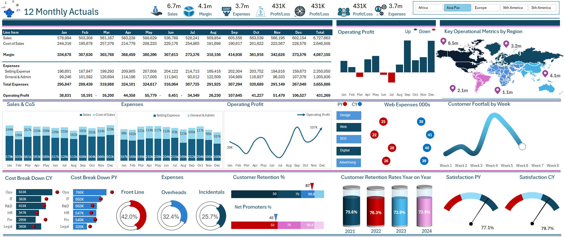
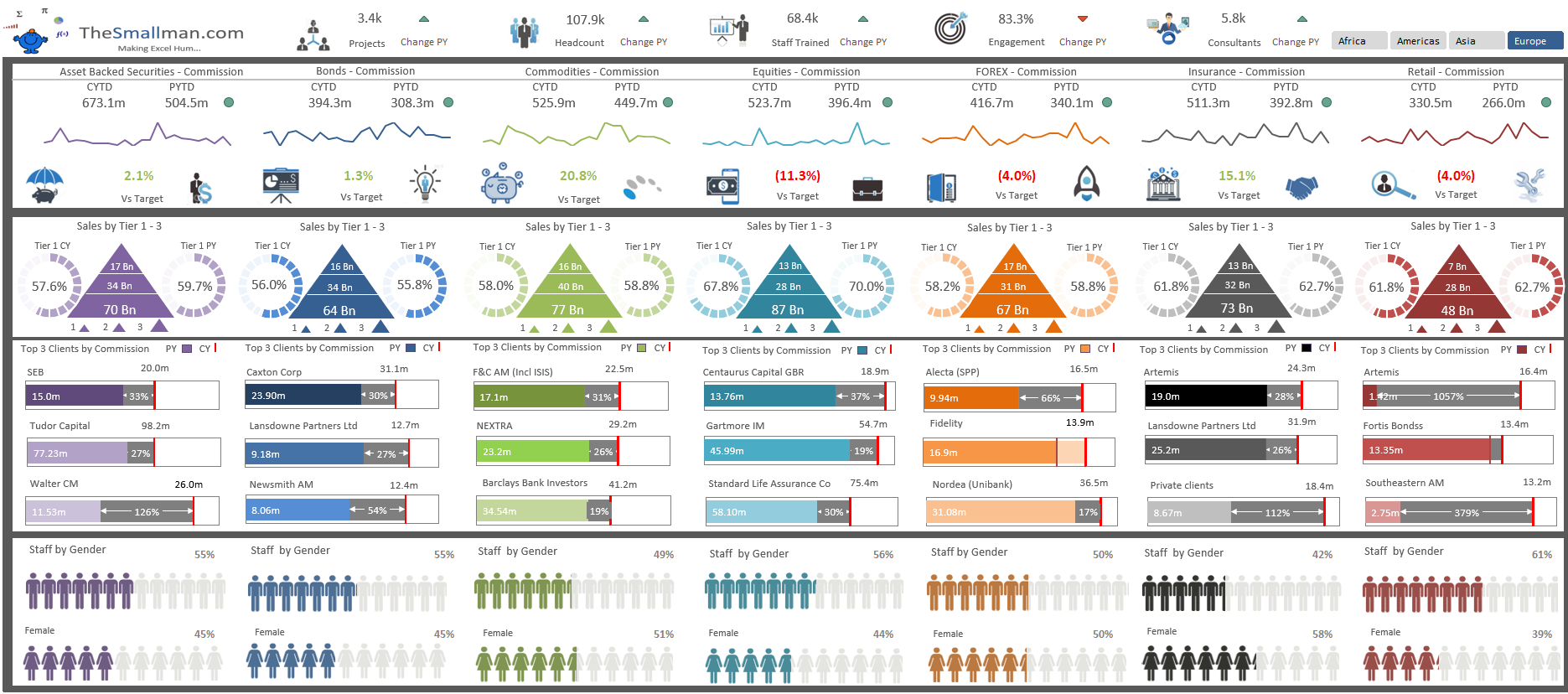
The above Excel dashboard is a summary of seven departments within a banking environment. It summarises the financial performance by region showing sales, commission, performance against plan and prior year to data and some human resources metrics by each department. It displays the data in a clear structured format providing a sound overview of key organisational metrics.

The dashboard is broken down into 3 very detailed segments. The first segment outlines some of the high level numbers at the top with a comparison using conditional formatting at the top. Some sparklines charts showing 24 months of data with comparisons to prior year and target revenue. Finally it gives a breakdown of tier 1 clients as a proportion of total clients. The tier 1 clients tend to make up a greater proportion of the income.

Excel dashboard layout

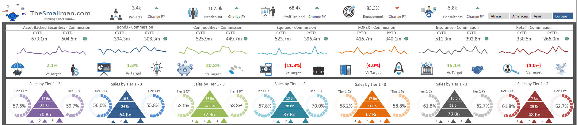
The next segment looks at the revenue by client. This breaks down the top 3 clients by operational department and changes by region at the top of the dashboard. This is highly dynamic and uses a pivot table in the back end to inform the 21 charts that are actually 84 charts when Africa, Asia, Americas and Europe are selected.

Latest Dashboard  Middle

Finally the dashboard ends with some HR metrics around gender diversity in the organisation by region. It is a visual way to show the data and gives viewers an at glance view of the make up of the department by gender.

Latest Dashboard metrics

The dashboard probably took me 20 hours to complete and I am quite pleased with the way this dashboard looks and feels. I made a video which outlines its functionality which can be seen below. Enjoy.


Source: https://www.thesmallman.com/premium-produc...
Tags Excel, Dashboards
← Multi-National Excel DashboardChange Pivot Table Filter From Cell →

Featured Posts

Excel Dashboards: Tracking a Crisis

Excel Dashboards: Tracking a Crisis
April 14, 2020

Recent Posts

Populating an Excel Table from a Range of Cells with VBA

Populating an Excel Table from a Range of Cells with VBA June 12, 2025

Fuzzy Distribution with Randbetween

Fuzzy Distribution with Randbetween May 21, 2025

Add Minimum and Maximum for Chart in Cells

Add Minimum and Maximum for Chart in Cells March 12, 2025

Inflation Over Multiple Years in a Single Cell

Inflation Over Multiple Years in a Single Cell January 10, 2025

Hubspot Dashboard

Hubspot Dashboard October 3, 2024

Monthly Dashboard With Supporting Metrics

Monthly Dashboard With Supporting Metrics September 25, 2024

Excel Show Missing Sheet Tabs

Excel Show Missing Sheet Tabs July 29, 2024

Run Macro Overnight Automatically

Run Macro Overnight Automatically June 24, 2024

Split File into Parts and Save to Directory

Split File into Parts and Save to Directory April 20, 2024

Most Popular Author

Most Popular Author December 14, 2023


Follow US:


MarcusSmall@thesmallman.com


TheSmallman.com - Making your small systems hum...
© Copyright 2013-2024 theSmallman.com All Rights Reserved.