Excel

TheSmallman.com

an XL ideas Lab

Dashboards VBA
  • Home
  • Dashboards
    • Tips & Tricks
    • Charts
    • Modelling
    • Infographics
    • VBA
  • Shop Dashboards
    • Power Pivot a User Guide
    • Excel Dashboard Course
    • Advanced Dashboard Course
    • Financial Modelling Course
    • Excel VBA Course
  • Blog
  • About
Menu

Excel Dashboards VBA

Street Address
City, State, Zip
Phone Number
an XL ideas Lab

Your Custom Text Here

Excel Dashboards VBA

  • Home
  • Dashboards
  • Excel Tips
    • Tips & Tricks
    • Charts
    • Modelling
    • Infographics
    • VBA
  • Shop Dashboards
  • PowerPivot
    • Power Pivot a User Guide
  • Courses
    • Excel Dashboard Course
    • Advanced Dashboard Course
    • Financial Modelling Course
    • Excel VBA Course
  • Blog
  • About

Excel Dashboard Designs

September 23, 2020 Marcus Small
Excel construction dashboard

New ideas for dashboards are becoming fewer as I get busier at work. However, occasionally I get inspired. I had a client ask to track some key metrics. Started with a neat dashboard template and build on it. Split into three levels the dashboard displays information by state and gives some of the key performance indicators for each of the business areas. I am not sure how I will use this Excel dashboard but most likely it will be the basis for a future course.
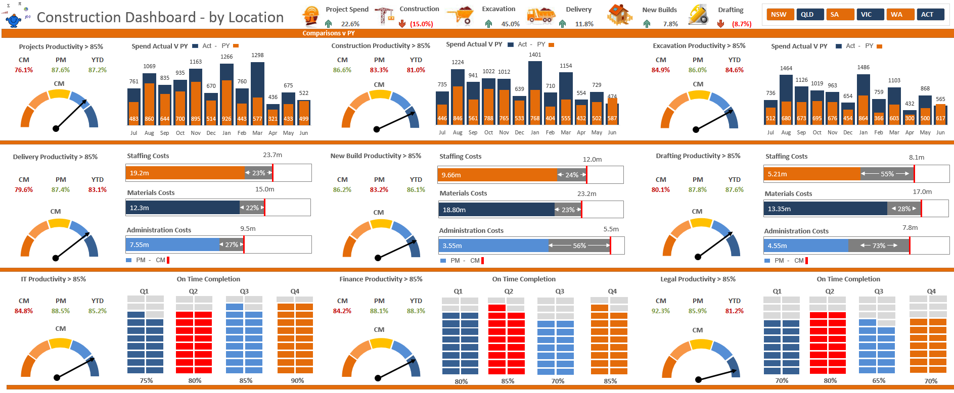
The Top Section

I usually put relevant images in the dashboard at the top header and relevant metrics near by. This is use of pretty much dead space and you will see it throughout my dashboards. The top section is most important and I include the most relevant metrics to the report. In this case there are 3 charts displaying productivity in a gauge and 3 charts displaying revenue and expense.

Top excel panel

Middle Section

In the middle section there are 3 charts displaying productivity in a gauge and 9 charts breaking down staffing costs, material costs and administrative costs. The charts display a comparison to the prior period for context.
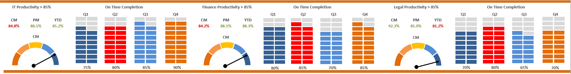
Middle excel part

Lower Section

In the bottom section there are 3 charts displaying productivity in a gauge and 12 charts displaying on time completion by quarter. It finishes off the dashboard nicely and consistently with the same colours begin used throughout the report. This is how I make all my dashboards, it is a small detail but works really nicely visually.

Lower Excel part
Source: https://www.thesmallman.com/premium-produc...
Tags Excel, Construction, Dashboard
← Change Pivot Table Filter From CellUpload Data with Power Query →

Featured Posts

Excel Dashboards: Tracking a Crisis

Excel Dashboards: Tracking a Crisis
April 14, 2020

Recent Posts

Populating an Excel Table from a Range of Cells with VBA

Populating an Excel Table from a Range of Cells with VBA June 12, 2025

Fuzzy Distribution with Randbetween

Fuzzy Distribution with Randbetween May 21, 2025

Add Minimum and Maximum for Chart in Cells

Add Minimum and Maximum for Chart in Cells March 12, 2025

Inflation Over Multiple Years in a Single Cell

Inflation Over Multiple Years in a Single Cell January 10, 2025

Hubspot Dashboard

Hubspot Dashboard October 3, 2024

Monthly Dashboard With Supporting Metrics

Monthly Dashboard With Supporting Metrics September 25, 2024

Excel Show Missing Sheet Tabs

Excel Show Missing Sheet Tabs July 29, 2024

Run Macro Overnight Automatically

Run Macro Overnight Automatically June 24, 2024

Split File into Parts and Save to Directory

Split File into Parts and Save to Directory April 20, 2024

Most Popular Author

Most Popular Author December 14, 2023


Follow US:


MarcusSmall@thesmallman.com


TheSmallman.com - Making your small systems hum...
© Copyright 2013-2024 theSmallman.com All Rights Reserved.