Excel

TheSmallman.com

an XL ideas Lab

Dashboards VBA
  • Home
  • Dashboards
    • Tips & Tricks
    • Charts
    • Modelling
    • Infographics
    • VBA
  • Shop Dashboards
    • Power Pivot a User Guide
    • Excel Dashboard Course
    • Advanced Dashboard Course
    • Financial Modelling Course
    • Excel VBA Course
  • Blog
  • About
Menu

Excel Dashboards VBA

Street Address
City, State, Zip
Phone Number
an XL ideas Lab

Your Custom Text Here

Excel Dashboards VBA

  • Home
  • Dashboards
  • Excel Tips
    • Tips & Tricks
    • Charts
    • Modelling
    • Infographics
    • VBA
  • Shop Dashboards
  • PowerPivot
    • Power Pivot a User Guide
  • Courses
    • Excel Dashboard Course
    • Advanced Dashboard Course
    • Financial Modelling Course
    • Excel VBA Course
  • Blog
  • About

Excel Dashboard Charting with Shapes

March 6, 2021 Marcus Small
New Excel Dashboard.PNG

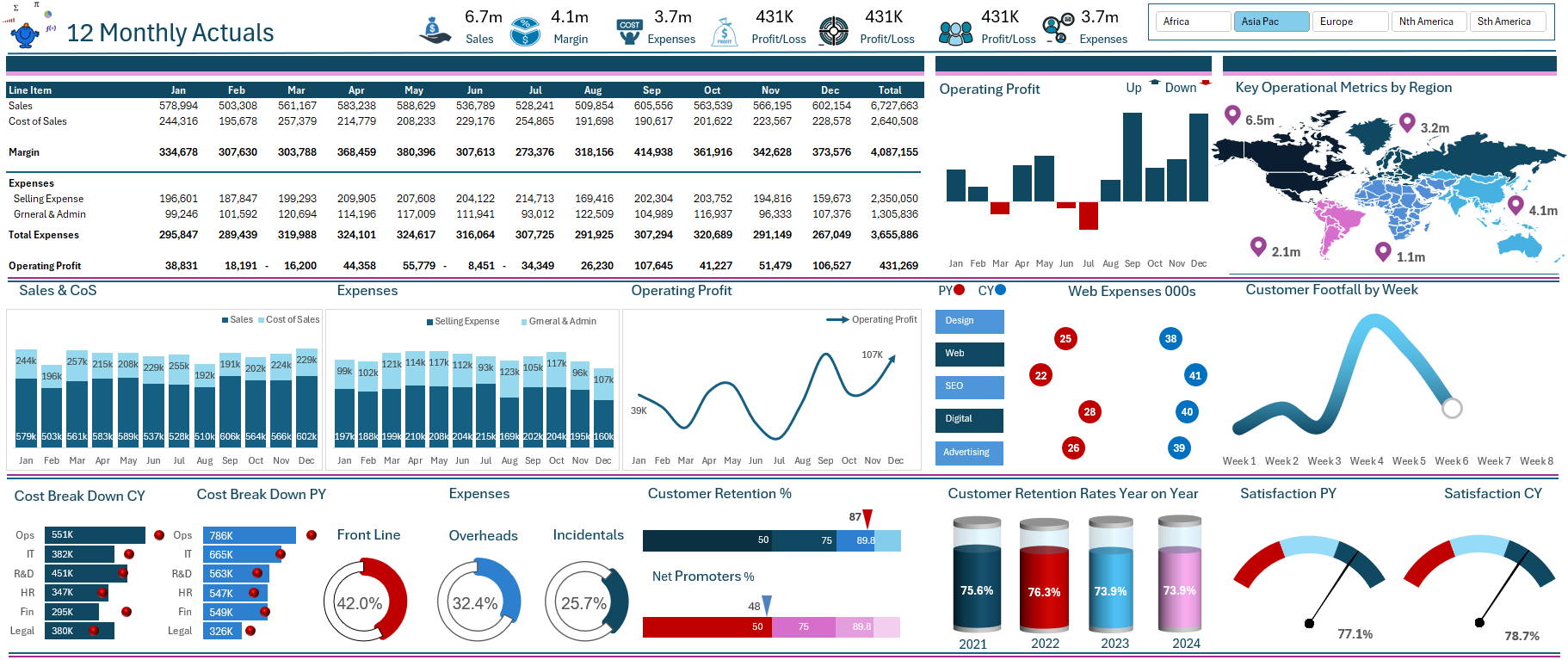
The above Excel dashboard is a derivation of a model I made for a client. It is a model that was required to compare actual sales, expenses and project data to a prior period.


The project went really well and I decided to keep the original layout and add my own data to the model to keep it generic. Also I added some really cool charts all of the images above are charts in Excel. This is a model that took quite some time to finalize as I kept chopping and changing what I wanted the final output to look like. The design process when creating these Excel dashboards is quite iterative. I change it constantly till i arrive on something that is both visually appealing and tells a compelling story.

New Model Pt 1.PNG

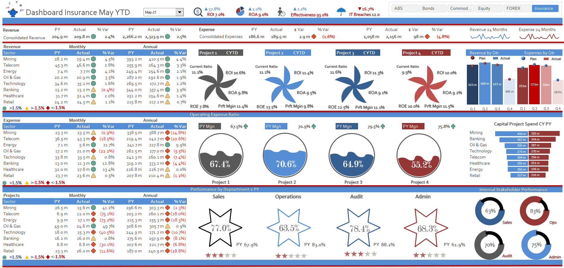
The above image summaries revenue against a prior period for month and year to date. It then goes on tot look at projects and gives some high level analysis of key operational metrics. Projects may be small in terms of length so comparisons become difficult in a small space.

New Model Pt 2.PNG

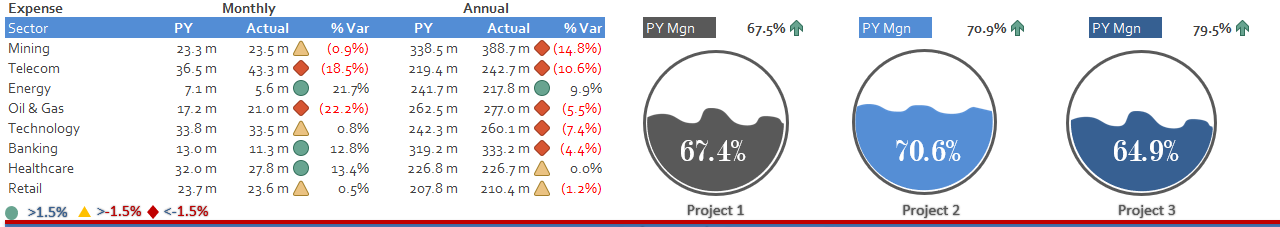
Expenses in the same way as revenue are compared at month and year to date. The projects margin is brought into this section with an interesting pie chart. There is sufficient room for a comparison. The area uses the space well as its is not too cramped.

New Model Pt 3.PNG

The final section covers the projects by industry sector. The model brings in comparisons for some of the departments within the company. All this data on a single A4 page. Telling a compelling story through an Excel Dashboard.

There are plenty of free Excel dashboards just like this one at the dashboard section of my website.

Dashboards

Source: https://www.thesmallman.com/premium-produc...
Tags Excel, Dashboards, Revenue, Expense, Projects
← Highlight Non Formula Text with Conditional Formatting Multi-National Excel Dashboard →

Featured Posts

Excel Dashboards: Tracking a Crisis

Excel Dashboards: Tracking a Crisis
April 14, 2020

Recent Posts

Populating an Excel Table from a Range of Cells with VBA

Populating an Excel Table from a Range of Cells with VBA June 12, 2025

Fuzzy Distribution with Randbetween

Fuzzy Distribution with Randbetween May 21, 2025

Add Minimum and Maximum for Chart in Cells

Add Minimum and Maximum for Chart in Cells March 12, 2025

Inflation Over Multiple Years in a Single Cell

Inflation Over Multiple Years in a Single Cell January 10, 2025

Hubspot Dashboard

Hubspot Dashboard October 3, 2024

Monthly Dashboard With Supporting Metrics

Monthly Dashboard With Supporting Metrics September 25, 2024

Excel Show Missing Sheet Tabs

Excel Show Missing Sheet Tabs July 29, 2024

Run Macro Overnight Automatically

Run Macro Overnight Automatically June 24, 2024

Split File into Parts and Save to Directory

Split File into Parts and Save to Directory April 20, 2024

Most Popular Author

Most Popular Author December 14, 2023


Follow US:


MarcusSmall@thesmallman.com


TheSmallman.com - Making your small systems hum...
© Copyright 2013-2024 theSmallman.com All Rights Reserved.