Anyone attending any of the CPA Australia Power BI courses that I run will know that I place a lot of emphasis on the final product in Power BI. It is imperative that the look and feel conveys a compelling story that management want to see and that is informative. Making creative dashboards in Power BI is no different to creating them in Excel. You are limited a little on space but the concepts remain the same. Space data out and align information in a logical manner.
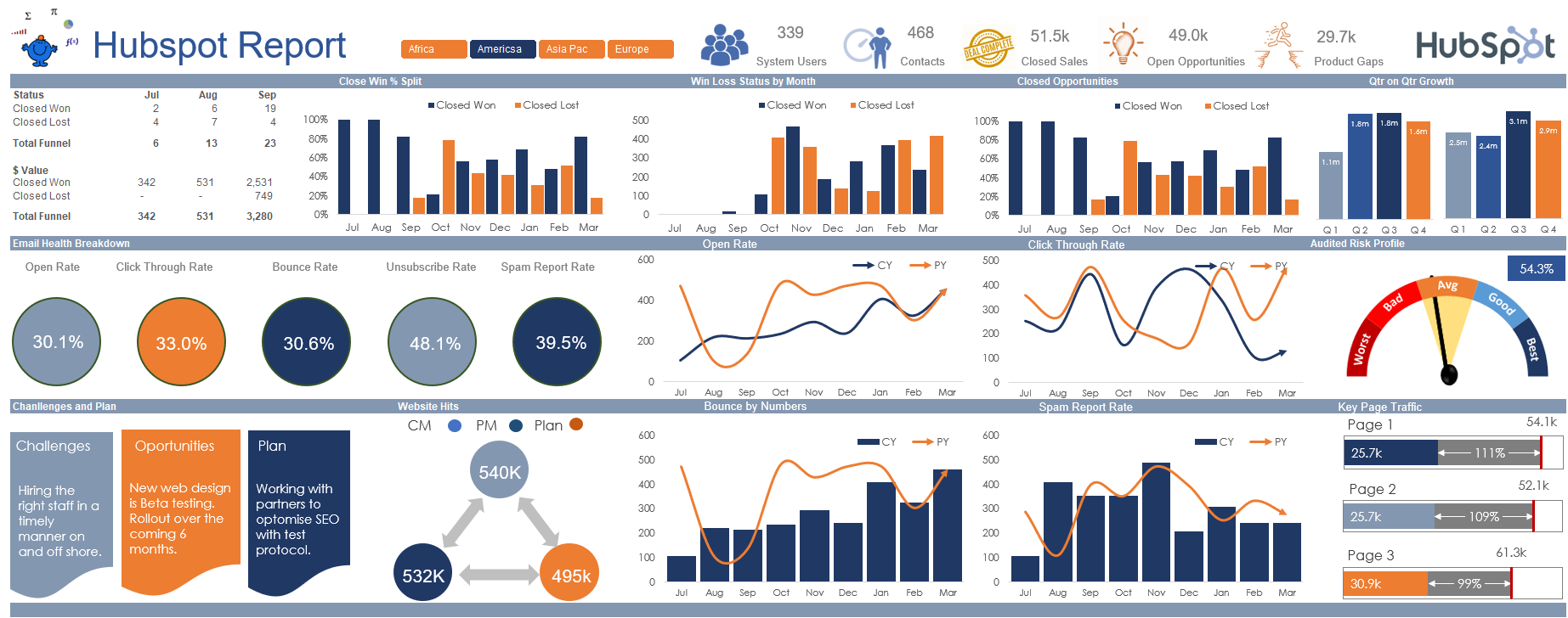
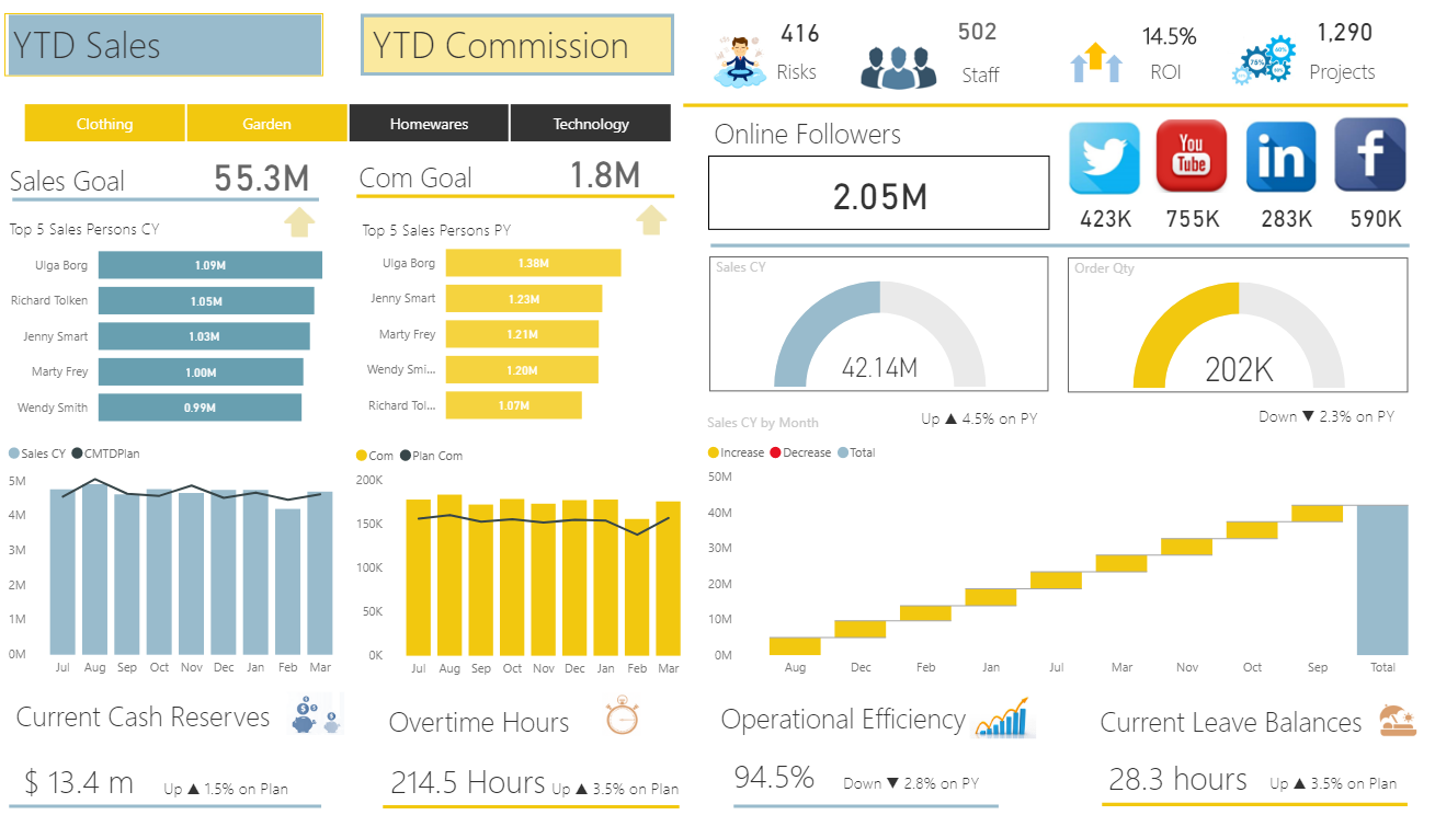
The following is an example from the Power BI course I run for more advanced users. It simplifies the data and presents it in a logical manner. The dashboard spins by department.
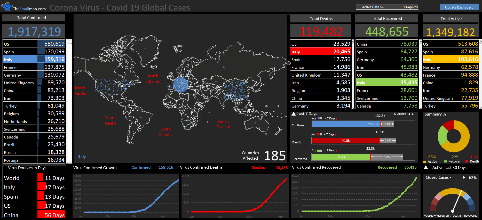
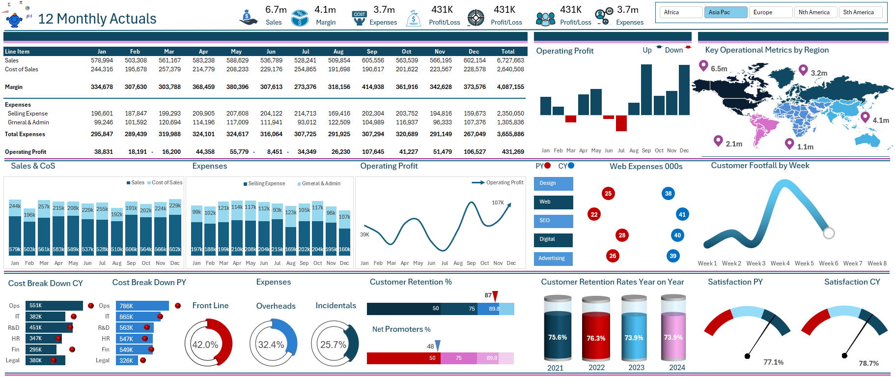
While the following data set does the same thing, spins on a set of criteria and shows a compelling output on a single page. The data spins on geographic region and shows some of the key operational and financial data on a single page.
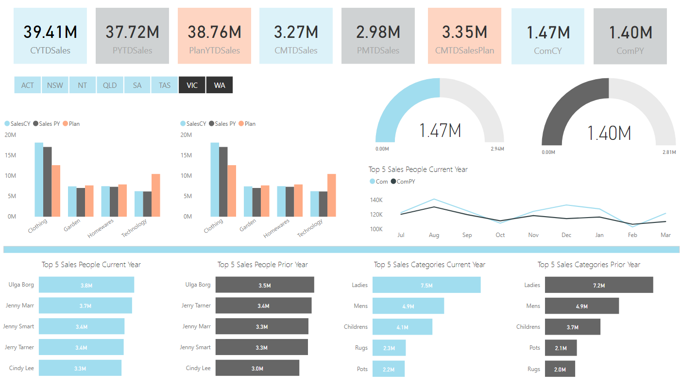
Creating reports like these is a methodical process where the uploaded data, the table joins and the dashboard metrics all come together to show a neat summary on a single page. There is a quite a lot of work to get to this point. The data must be imported, transformed in most cases, DAX is quite often deployed to enhance the calculations which draw on the data and then finally putting it into a meaningful display that can be changed and drilled into in some way can be quite a long process. However, it is almost always a set and forget process that once complete allows you to just draw on fresh data on a daily, weekly, or monthly timeline.
When you get to see results like the above it becomes well worth it and allows on time decisions to be make by management.