

A Dynamic Pareto Chart in Excel
A Pareto chart in Excel is a chart which is made up of a column chart and a line chart to show a cumulative position. This is often a good chart to show an 80 20 scenario, where 80 % of the costs are achieved by 20% of the cost drivers. The chart can be created by segmenting the the data into cost drivers or buckets. If your business expenses were allocated into the following buckets:
Staff
Building
Legal
Accounting
Rates
Entertainment
Marketing
Featured Posts
Recent Posts

Populating an Excel Table from a Range of Cells with VBA June 12, 2025

Fuzzy Distribution with Randbetween May 21, 2025

Add Minimum and Maximum for Chart in Cells March 12, 2025

Inflation Over Multiple Years in a Single Cell January 10, 2025
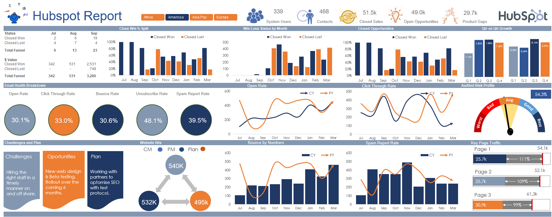
Hubspot Dashboard October 3, 2024
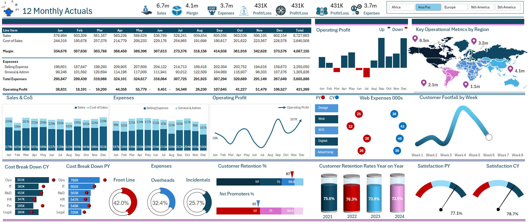
Monthly Dashboard With Supporting Metrics September 25, 2024
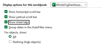
Excel Show Missing Sheet Tabs July 29, 2024

Run Macro Overnight Automatically June 24, 2024

Split File into Parts and Save to Directory April 20, 2024

Most Popular Author December 14, 2023