

Water Statistics Infographic in Excel
The above infographic is a look at how we use water and what is expected to happen if there is a 2 degrees increase in global temperatures . Governments are good for changing long term policy for change in our world but if you want to enact real change you have to make it yourself. If everyone collectively agrees to change - change happens in our world. Our world will continue to grow in population. If 7 billion people agreed to enact change as a collective - climate change, world poverty etc, would end very quickly in my opinion.
Read More
Road Traffic Statistics in Excel
While going through some road traffic information on the Department of Transport's website it occurred to me that the data was perfect to create a dashboard. It was information rich and there were very little gaps in the data. I decided to use quite a few pictures in conjunction with the charts to try and spice them up. I have used actual data but had to ‘normalise’ some of the data as there were a few gaps.
Read MoreFeatured Posts
Recent Posts

Populating an Excel Table from a Range of Cells with VBA June 12, 2025

Fuzzy Distribution with Randbetween May 21, 2025
Add Minimum and Maximum for Chart in Cells March 12, 2025

Inflation Over Multiple Years in a Single Cell January 10, 2025
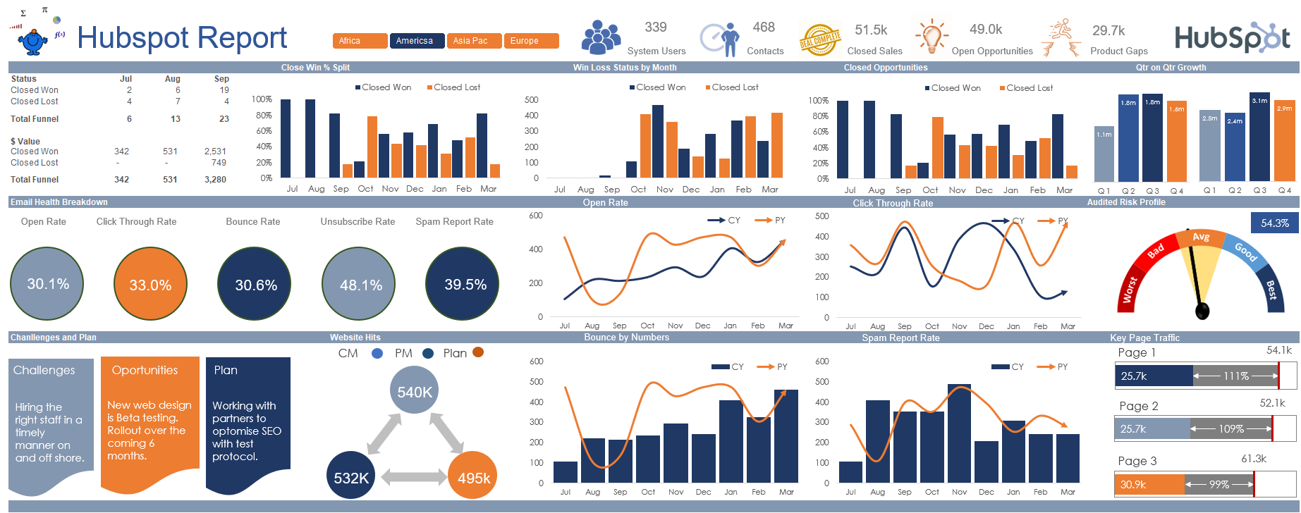
Hubspot Dashboard October 3, 2024
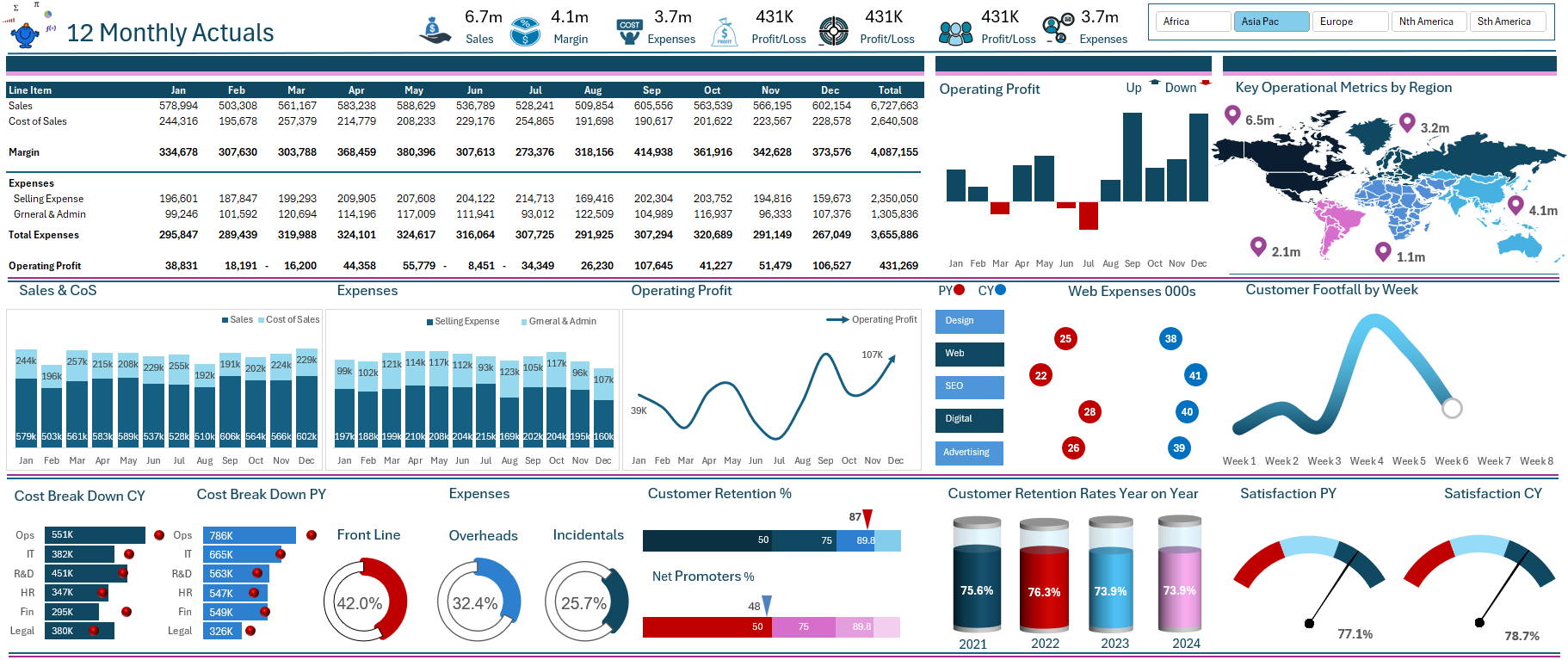
Monthly Dashboard With Supporting Metrics September 25, 2024
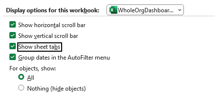
Excel Show Missing Sheet Tabs July 29, 2024

Run Macro Overnight Automatically June 24, 2024

Split File into Parts and Save to Directory April 20, 2024

Most Popular Author December 14, 2023