Excel

TheSmallman.com

an XL ideas Lab

Dashboards VBA
  • Home
  • Dashboards
    • Tips & Tricks
    • Charts
    • Modelling
    • Infographics
    • VBA
  • Shop Dashboards
    • Power Pivot a User Guide
    • Excel Dashboard Course
    • Advanced Dashboard Course
    • Financial Modelling Course
    • Excel VBA Course
  • Blog
  • About
Menu

Excel Dashboards VBA

Street Address
City, State, Zip
Phone Number
an XL ideas Lab

Your Custom Text Here

Excel Dashboards VBA

  • Home
  • Dashboards
  • Excel Tips
    • Tips & Tricks
    • Charts
    • Modelling
    • Infographics
    • VBA
  • Shop Dashboards
  • PowerPivot
    • Power Pivot a User Guide
  • Courses
    • Excel Dashboard Course
    • Advanced Dashboard Course
    • Financial Modelling Course
    • Excel VBA Course
  • Blog
  • About

A Self Colouring Waterfall Chart

March 13, 2015 Marcus Small
Waterfall.PNG

The waterfall chart has been around a while and whenever using them the charts have always frustrated me because they were coloured manually.  I decided to have a crack at the problem to produce a chart with 3 different colours, red for when there is a downward trend, green for when there is an upward trend and no colour to help emphasise the movement.

I have done some work in the past and these are the waterfall models I have linked to the Smallman.com

Waterfall

This is an example of the waterfall chart in the attached file.

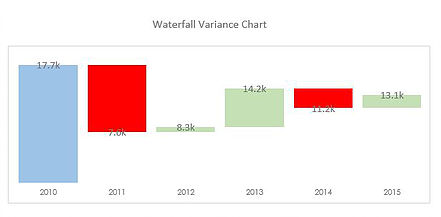
The colours are added to the above chart automatically which takes some of the leg work out if there is a movement from month to month.  Blue is the starting point, red is any negative movement, green represents any positive movement.

Here is some sample data from the above waterfall chart.

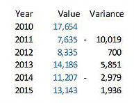
The text in blue is the actual data for each year, while the data in the variance column just shows the year on year movement.

The trick is to create 3 columns (I created a 4th for the label) and to use formula to trap the movement.

The White, Red and Green columns establish movement from prior year and each is a series on the chart.  The label corresponds with the Value from the first sample data.  

The White column shows last year actual minus Red plus Green.

The Red Column shows the variance represented as a positive number only if it was negative.

The Green column shows the variance if it was positive. 

The label is the actual data.

The following Excel file outlines the technique with all of the formula for the self colouring waterfall chart.

Waterfall.xlsx

← Format Chart Numbers as Thousands or Millions Showing Trends with a Chart →

Featured Posts

Excel Dashboards: Tracking a Crisis

Excel Dashboards: Tracking a Crisis
April 14, 2020

Recent Posts

Populating an Excel Table from a Range of Cells with VBA

Populating an Excel Table from a Range of Cells with VBA June 12, 2025

Fuzzy Distribution with Randbetween

Fuzzy Distribution with Randbetween May 21, 2025

Add Minimum and Maximum for Chart in Cells

Add Minimum and Maximum for Chart in Cells March 12, 2025

Inflation Over Multiple Years in a Single Cell

Inflation Over Multiple Years in a Single Cell January 10, 2025

Hubspot Dashboard

Hubspot Dashboard October 3, 2024

Monthly Dashboard With Supporting Metrics

Monthly Dashboard With Supporting Metrics September 25, 2024

Excel Show Missing Sheet Tabs

Excel Show Missing Sheet Tabs July 29, 2024

Run Macro Overnight Automatically

Run Macro Overnight Automatically June 24, 2024

Split File into Parts and Save to Directory

Split File into Parts and Save to Directory April 20, 2024

Most Popular Author

Most Popular Author December 14, 2023


Follow US:


MarcusSmall@thesmallman.com


TheSmallman.com - Making your small systems hum...
© Copyright 2013-2024 theSmallman.com All Rights Reserved.