Excel

TheSmallman.com

an XL ideas Lab

Dashboards VBA
  • Home
  • Dashboards
    • Tips & Tricks
    • Charts
    • Modelling
    • Infographics
    • VBA
  • Shop Dashboards
    • Power Pivot a User Guide
    • Excel Dashboard Course
    • Advanced Dashboard Course
    • Financial Modelling Course
    • Excel VBA Course
  • Blog
  • About
Menu

Excel Dashboards VBA

Street Address
City, State, Zip
Phone Number
an XL ideas Lab

Your Custom Text Here

Excel Dashboards VBA

  • Home
  • Dashboards
  • Excel Tips
    • Tips & Tricks
    • Charts
    • Modelling
    • Infographics
    • VBA
  • Shop Dashboards
  • PowerPivot
    • Power Pivot a User Guide
  • Courses
    • Excel Dashboard Course
    • Advanced Dashboard Course
    • Financial Modelling Course
    • Excel VBA Course
  • Blog
  • About

Bubble Chart in Excel

March 26, 2015 Marcus Small

Creating Bubble charts in Excel is reasonably straight forward. They are very similar to a line chart without the line and with a bit more pizazas. You will find quite a few Bubble Charts on thesmallman.com particularly in the dashboard section.

The following article will take you through how to make one.

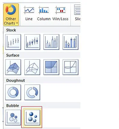
On the Insert menu – Choose Other Charts - 3D Bubble Chart

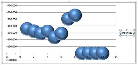
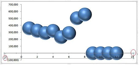
Don’t be concerned by the look of the chart.  We will fix it from this point onwards.

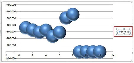
Click on the series and choose delete.

Remove the Horizontal and Vertical Axis

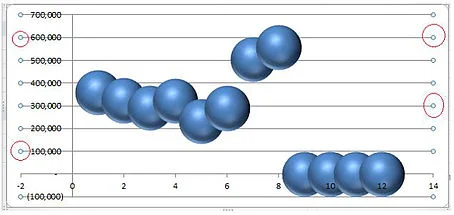
Highlight the Horizontal axis and click delete

Do the same for the Vertical Axis.


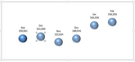
Resize the Bubbles in the Chart

Excel tends to make the bubbles bigger than they need to be.  We can reduce their size.

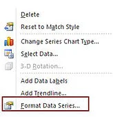
Right click on any of the bubbles and choose Format Data Series.

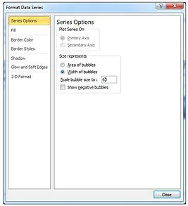
Under Series Options Choose Width of Bubbles and make the width 60.

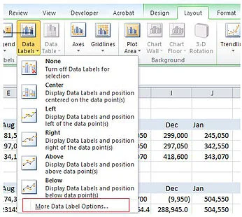
Click on any of the bubbles and from the Layout Menu Choose Data Labels –

More Data Label Options

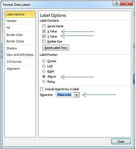
Under Label Options Check the buttons

X Value
Y Value

Label Position: Above
Separator: New Line

Insert a Chart Title

Click on the chart and from the layout menu choose Chart Title.

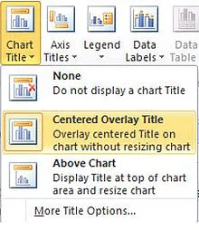
Format the chart title to your liking.

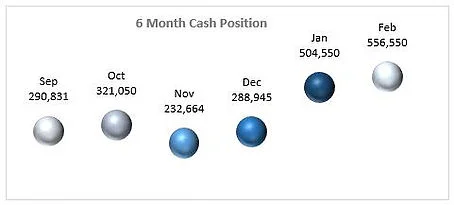
Choose a Bubble Colour Scheme

By clicking on each of the bubbles individually we can change the colour of the bubbles in the chart. Notice I have changed the colour of the first bubble and the second bubble is highlighted. Change the colour of each bubble in turn.

Be careful to change the colours so they are in line with the theme you want for the chart.

Tags Excel, Bubble, chart
← Evaluate and Filter in Harmony Format Chart Numbers as Thousands or Millions →

Featured Posts

Excel Dashboards: Tracking a Crisis

Excel Dashboards: Tracking a Crisis
April 14, 2020

Recent Posts

Populating an Excel Table from a Range of Cells with VBA

Populating an Excel Table from a Range of Cells with VBA June 12, 2025

Fuzzy Distribution with Randbetween

Fuzzy Distribution with Randbetween May 21, 2025

Add Minimum and Maximum for Chart in Cells

Add Minimum and Maximum for Chart in Cells March 12, 2025

Inflation Over Multiple Years in a Single Cell

Inflation Over Multiple Years in a Single Cell January 10, 2025

Hubspot Dashboard

Hubspot Dashboard October 3, 2024

Monthly Dashboard With Supporting Metrics

Monthly Dashboard With Supporting Metrics September 25, 2024

Excel Show Missing Sheet Tabs

Excel Show Missing Sheet Tabs July 29, 2024

Run Macro Overnight Automatically

Run Macro Overnight Automatically June 24, 2024

Split File into Parts and Save to Directory

Split File into Parts and Save to Directory April 20, 2024

Most Popular Author

Most Popular Author December 14, 2023


Follow US:


MarcusSmall@thesmallman.com


TheSmallman.com - Making your small systems hum...
© Copyright 2013-2024 theSmallman.com All Rights Reserved.