How to Create an Excel Dashboards
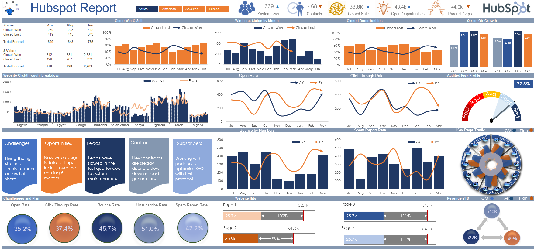
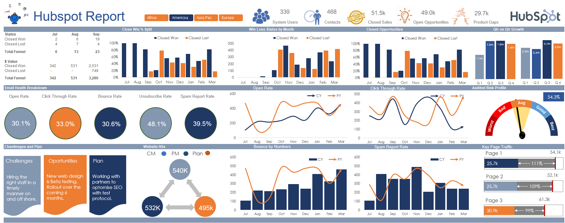
A Hubspot Dashboard using Excel
Dashboards are the modern day way to display informative meaningful data. They show key information in a defined space. The rules and process behind making key performance dashboard will be covered in this article.
Data collection is a crucial step in understanding how your projects are progressing. Excel spreadsheets are the ideal tool for managing all that data, too.
But data by itself is just a collection of numbers on a page – not so. Dashboards are necessary in order to make it accessible. We'll learn about the Excel dashboard in this article. Let’s walk through the procedures for making one and also show you how to do it more easily.
An Excel Dashboard Explained
A dashboard is an easily understood visual depiction of key performance indicators (KPIs), important business metrics, and other complex data.
The raw data by itself is not the most glamorous of things to deal with. You must therefore make that data into something more meaningful with trends and summary tables. A dashboard made with Microsoft Excel is the ideal tool for the task at hand. Fortunately, Excel allows you to construct both static and dynamic dashboards.
What makes a difference?

Static dashboards show data from a given period of time. It is always the same. Dynamic dashboards, on the other hand, are updated every specific period to reflect changes in operational activities. An Excel Dashboards are fantastic resources for the systematic monitoring of key data points against agreed upon targets to provide management with meaningful information to help with decisions across t he organisation.
Excel Dashboard Benefits
A well designed dashboard provides you with a concise, comprehensive summary of the Key Performance Indicators for your company.
Increases a sense of accountability by allowing various departments and individuals to see the areas that need improvement.
Delivers sophisticated computations and strong analytical capabilities.
Aids in improving the judgements you make for your company
Phases to Creating an Excel Dashboard
Phase 1: Open Excel and import the required data
Loading data into Microsoft Excel should be the first step. Importing data into Excel may be a little time consuming. However, the time invested to get data into Excel in a repeatable way will be well worthwhile. There are a few different approaches to loading data.
You can import data by:
Copying and pasting data from its original source.
Load directly through API calls or ODBC connections.
Utilise the Microsoft Power Query for Excel.
Visual Basic for Applications (VBA), importing from the data source.
The ideal method to import data into Excel may require some investigation, as the optimal approach will ultimately rely on the type of data file you have.
Phase 2: Assemble your worksheet.
You may now set up your workbook by inserting tabs after your data is in Excel.
Create a new Excel workbook and fill it with worksheets, often known as Excel tabs.
Designate your worksheet so the data is clearly separated. Your input data goes on the far left, your calculations go in the middle and your output data goes on the far right of the workbook.
A typical dataset comprises:
Date based data, day, week, month, quarter.
The organisations budget by area, region, department etc.
The quantity of team members assigned to every project.
Phase 3: Add the Input data to the File
The input data should be well structured in a tabular format - stored in rows and columns. Using multiple sheets is the most ideal method to organise and calculate a model.
Putting all of a company's data into one workbook with no links to other workbooks and creating a consolidation tab makes great sense.
Phase 4: Data analysis
Although this step might just tire your brain, it will help you create the right dashboard for your needs. See all the input data you've collected, explore it and decide what you want to use on your dashboard page. If you decide what you want the final output needs to look like you can work backwards and create calculation that draw on your inputs.
Add these data points to the chart details worksheet. For example, we want to highlight the department name, end month and budget. So we copy these three data columns from Excel and paste them into the data tab of the chart.
Knowing the reason ought to facilitate the work and assist you with sifting through every one of the superfluous information.
Breaking down your information will likewise assist you with understanding the various apparatuses you might need to use in your dashboard.
A portion of the choices include:
Charts: to show data using Excel formulas: for filtering and complex calculations.
Conditional formatting: highlights areas of interest with colour or icons.
PivotTable can be used to automate the spreadsheet's responses to specific data points:
Power Pivot: to sort, reorder, count, group, and sum data in a table: to work with large data sets and create data models.
Phase 5: Generate the Charts and tables
The next step is to decide which visuals and dashboard design best represent your data.
For example, you should pay attention to other Excel graphs as follows.
Column chart a vertical chart that lays data out by time period very well.
Bar chart: a horizontal chart that stacks lines of data.
Waterfall chart: view how an initial value increases and decreases through a series of alterations to reach an end value
Heat Map chart : represent data in a dial. Also known as a speedometer chart
Pie Chart and Doughnut charts: highlight percentages and proportional data
Line Chart in Excel: These charts are great for 2 part comparisons.
Dynamic Chart in Excel: Charts that auto update, these dynamic charts can be helped with an Excel table.
Pay attention to the dynamism of the charts so they are easily updatable.
Additionally adding Slicers to your reports allows the charts to update easily.
Interactive Excel dashboards are the ideal goal when it comes to the creation and charting process.
Phase 6: Arrange the data into a dashboard
Be sure to put all of the data into a structured one page report. Keep the data aligned to make it easy for the user to absorb the data.
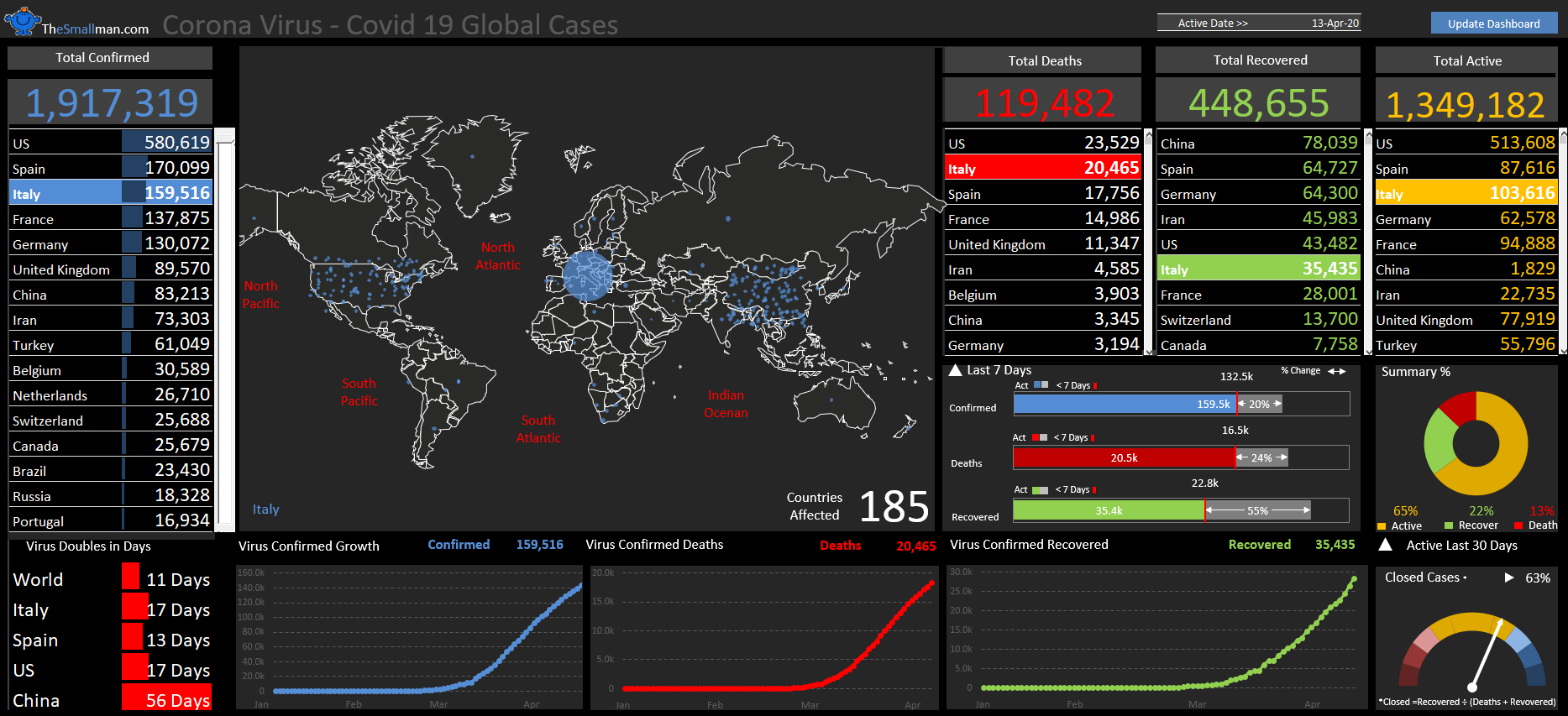
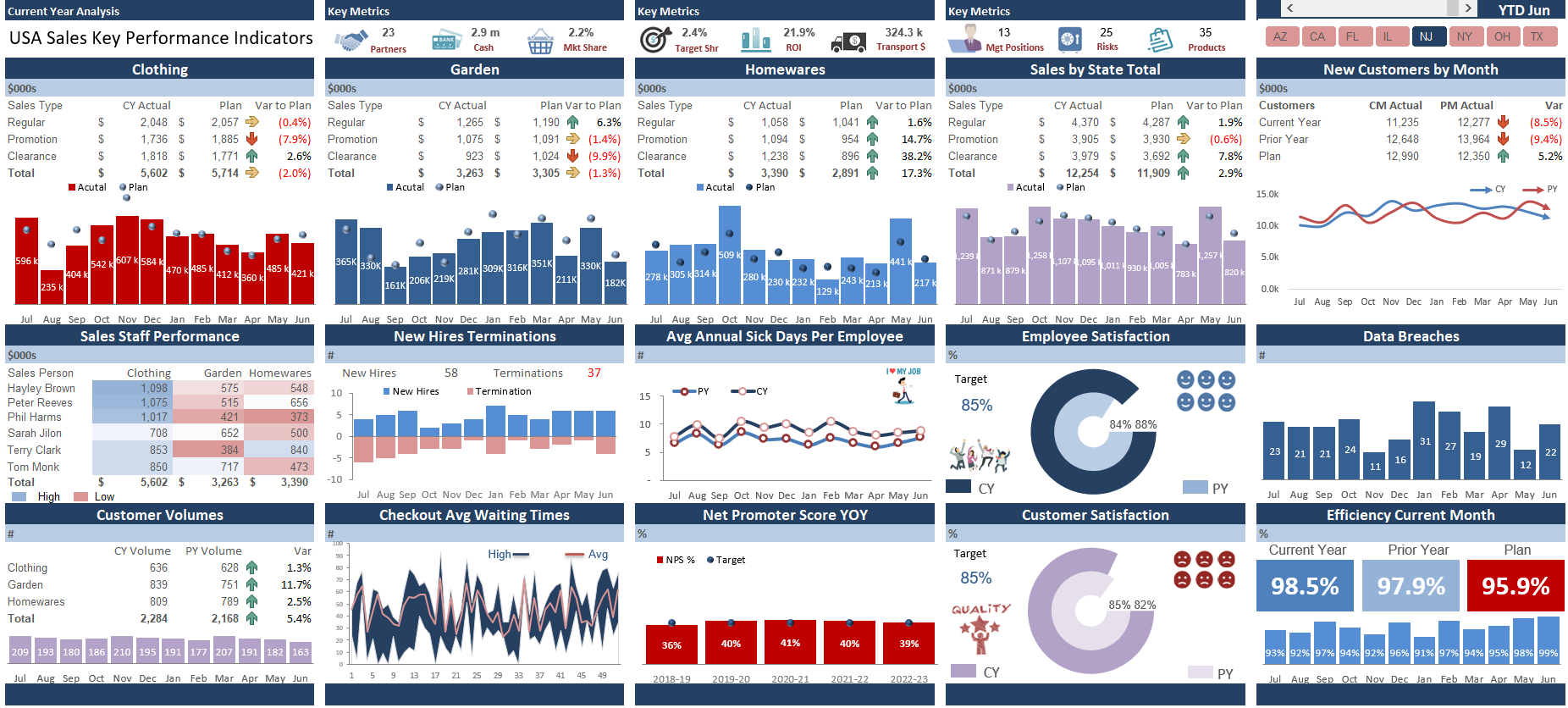
Create a Dashboard in Excel
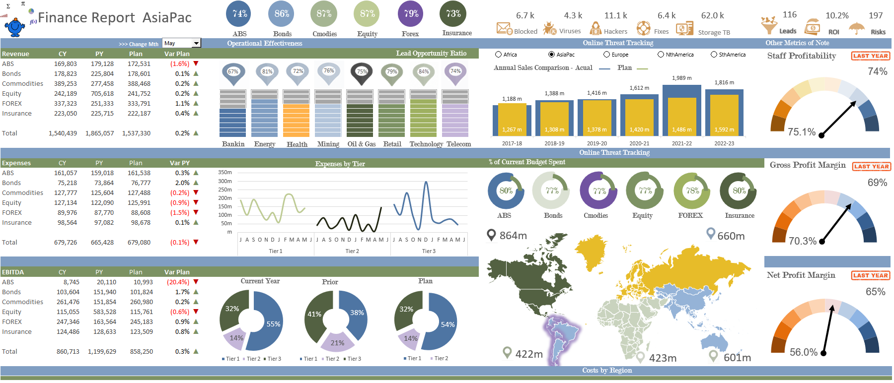
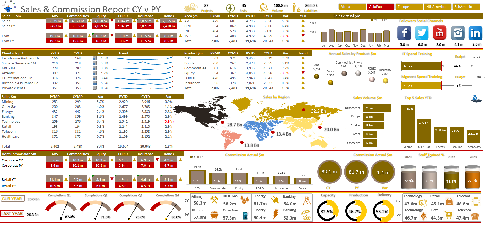
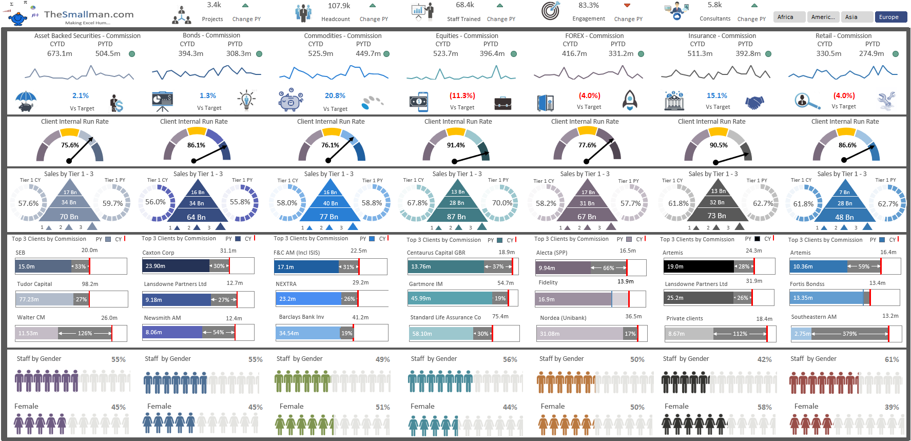
The data should be set out in a grid with all the elements aligned so that it is aligned both vertically and horizontally. Notice the dashboard above has data aligned into segments. This is the basic structure and you should stick to it. Many many more Excel Dashboards can be found on this site and there are a great many to download.
Create A Excel Dashboard Tutorial
A brief dashboard tutorial I created is available on YouTube. This describes how to gather data from the internet and prepare it so that you may create an educational Excel dashboard that is one page long. Using the step-by-step instructions, you may create the dashboard from the ground up.
The following are a number of free Excel dashboard files that are free to download. The dashboard links are at the bottom of each page. These Excel templates are able to be downloaded from the following link. With these examples it will help you learn how to create an Excel file is easy to understand. Go out and create dashboards in Excel. If you start building your skill will improve with time.
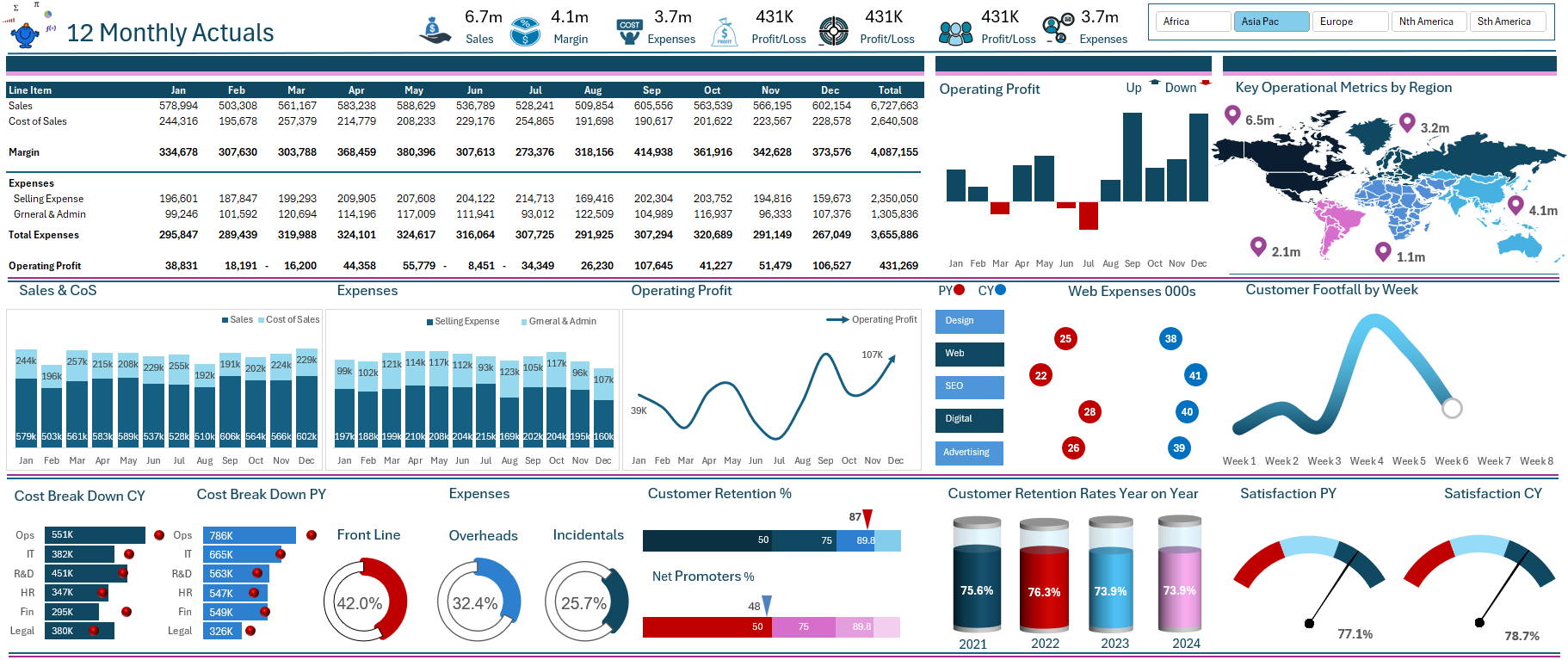
The above a small fraction of what is available on the primary dashboard page of this site. More data can be found on the dashboard page.